mohcinelasmar.com
Landing Page Analysis
Summary:
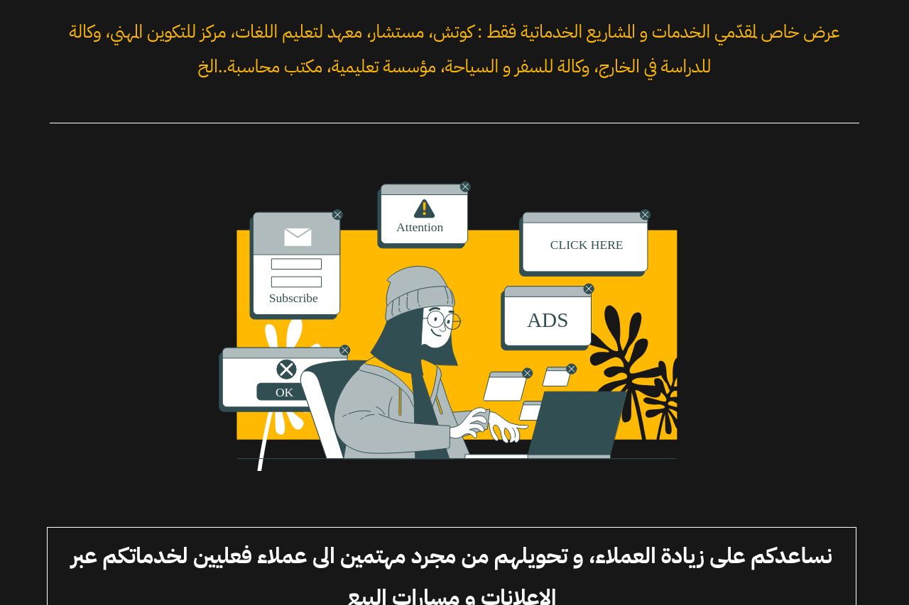
this page looks like it tried to be loud and premium at the same time, but it ends up shouting without giving you a clear reason to stay. the dark background with saturated yellow borders and blocks creates a strong visual punch, but it also fractures the reading flow and makes important messages easy to miss. the hero text is long and not immediately actionable, and the main value proposition is buried under a sea of decorative boxes. the call-to-action sits inside a bold yellow panel, which is visually dominant but floats away from a concise promise or benefit. the form in the left panel is bulky and not clearly labeled for an arabic reader, and the content-heavy yellow panel on the right distracts rather than clarifies. the section that promises “results” is simply a grid of screenshots with no context or measurable outcomes, which hurts credibility. overall, there is energy and style, but the page lacks a single, crisp value proposition, a clean information hierarchy, and trust signals that would turn visitors into leads. if you want people to actually convert, you need to stop treating the page as a collage of good ideas and start treating it as a guided, high-credibility experience that takes a visitor from problem recognition to a concrete next step in minutes, not seconds.
- crystalize the main offer in one clear, benefit-driven headline above the fold (e.g., "دِعْنا نزيد عملاءك عبر إعلانات و مسارات بيع مخصصة لعملاءك"). provide a short subhead with one concrete example of outcome.
- simplify the hero into two lines max: a single value prop + a concrete example or preview, then place the primary CTA immediately after.
- reduce visual clutter by consolidating the right-hand yellow panel. use a single, prominent hero CTA and move secondary CTAs to relevant sections (after sections, not all at once).
- streamline the form: fewer fields, inline validation, and clear labeling in Arabic (placeholders are fine, but labels and required fields must be obvious). consider a multi-step form to improve completion rates.
- establish clear trust signals near the CTA: client logos, a short testimonial, a privacy note, and a visible contact option. replace the generic dashboard screenshots with annotated case-study cards that include numbers.
- unify typography and spacing: choose one responsive font stack, unify heading sizes, and create a consistent rhythm so the eye doesn’t bounce between sections.