brevo.com
Landing Page Analysis
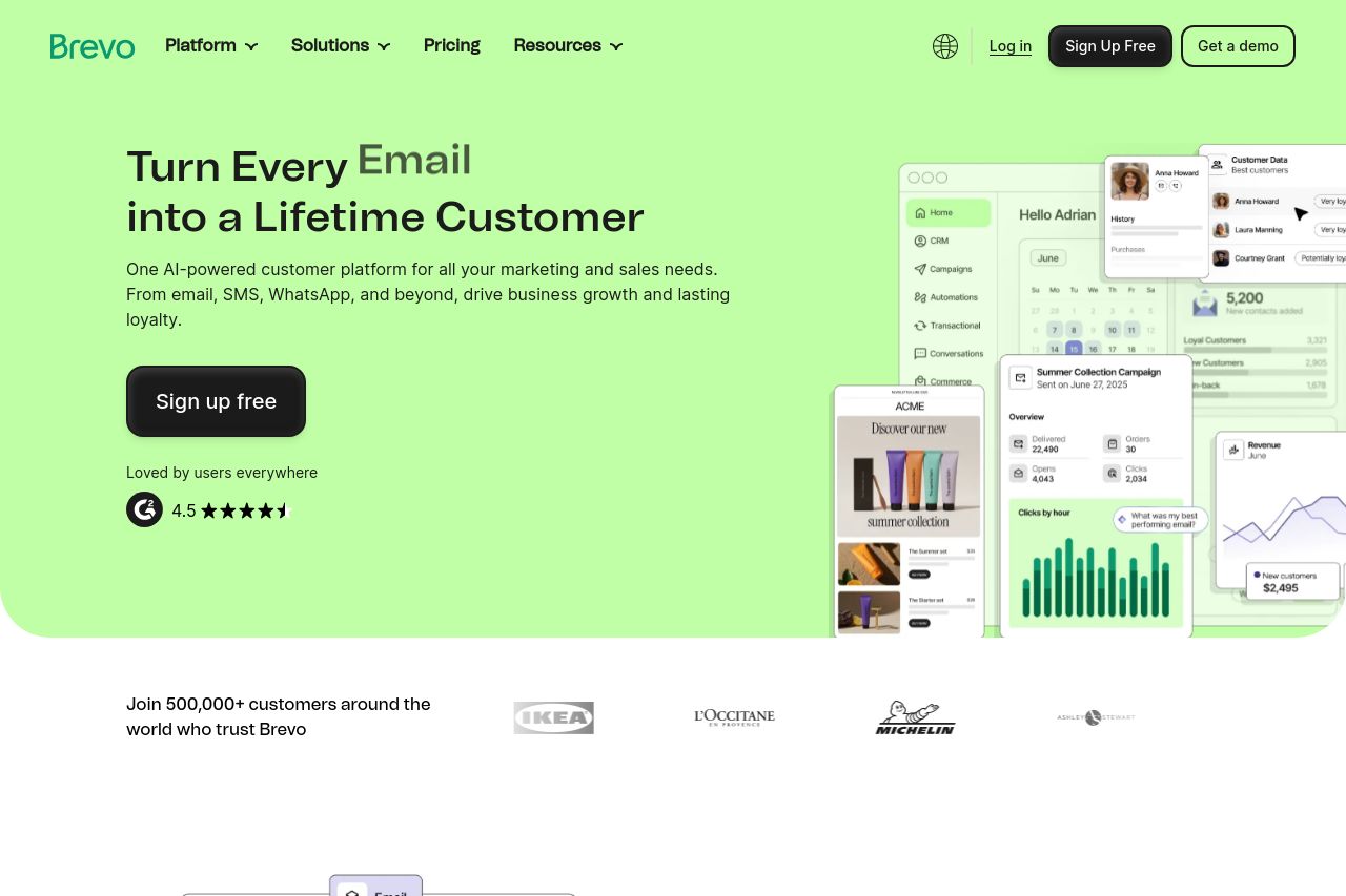
Brevo is the most intuitive all-in-one customer engagement platform: email and SMS marketing, automation, CRM, live chat, and transactional email. Try it free.

Summary:
Bold truth time: the Open Graph data for Brevo is functionally fine but emotionally dead. the title piles keywords in a vacuum—“Email & SMS Marketing, CRM & Automation | Brevo”—which tells me what you do but not why I should care or what outcome I’ll get. it sounds generic, not differentiated, and it doesn’t promise a result I can’t get elsewhere. the meta description is a tad long but technically descriptive: it lists features (email, sms, automation, crm, live chat, transactional email) and ends with a vague “Try it free,” which is decent as a CTA but doesn’t create urgency or a concrete win. with no og:image, social previews will look empty and forgettable, so shares may get scrolled past before anyone even reads the copy. in short, the metadata screams “we are a big SaaS tool,” but it doesn’t scream a compelling reason to click or remember Brevo over competitors. the OG data should reflect a crisp, outcome-driven hook, not a laundry list of capabilities. to fix this, give me a value-led title, a benefit-focused description that differentiates Brevo, and a branded og:image that actually shows the product in use or certifies trust. add a concrete CTA in the metadata too, not just a passive invitation to try for free. then ensure the page itself mirrors that promise so the social preview aligns with the on-site experience.
- Rewrite the OG title to be outcome-driven and differentiating (e.g., “Grow revenue with Brevo: All-in-one Email, SMS, CRM & Automation”).
- Craft a benefit-focused OG description that highlights a single, compelling outcome and uses a clear CTA (e.g., “Automate marketing, boost retention, and grow revenue—start free”).
- Add a high-quality branded og image (1200x630) showing Brevo in use or a strong visual that communicates the platform’s impact, and include og:image and related meta tags so social previews aren’t visually dull.