mind4winners.com
Landing Page Analysis
mind4winners
76
Share on:
Summary:
78
Messaging
72
Readability
75
Structure
62
Actionability
84
Design
60
Credibility
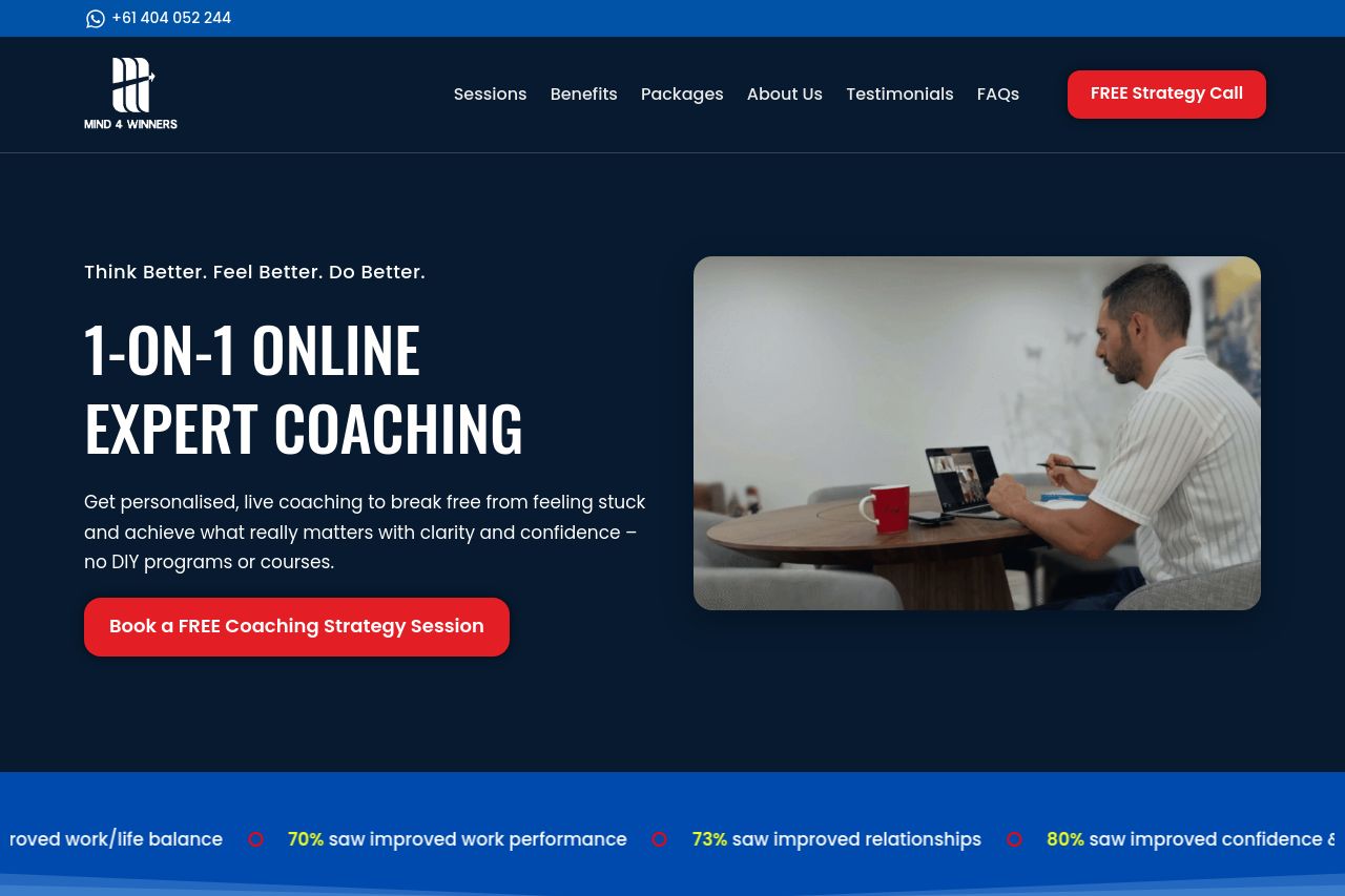
Bold, high-contrast hero with a clear service promise, but the page shoots for speed with too many CTAs and not enough clarity on who exactly it’s for. The video and the “How our sessions work” section help, but the core value proposition isn’t laser-focused, and trust signals are underdeveloped. Pricing is visible, but features per plan are vague. Overall, strong visuals, decent structure, but the messaging and credibility need sharpening to convert coaching-seekers into booked sessions.
Main Recommendations:
- Clean up CTAs: choose one primary CTA after the hero (e.g., Book a Strategy Session) and move the other to a secondary, less prominent spot or convert it into a text link. This reduces decision fatigue and guides users to action.
- Sharpen the value proposition and define the audience: add a concise audience-specific line in the hero (e.g., “For ambitious professionals who want clarity and momentum”) and explicitly state the outcome users can expect from coaching.
- Improve credibility with concrete proof: add a founder bio, coach bios, client logos or at least a couple of case-study snippets, and basic policies/contact info in the header/footer to boost trust.