launchdirectories.com
Landing Page Analysis
100+ Product Hunt alternatives & startup directories with traffic stats & guides. Free & paid options. Build backlinks, launch your product.
Summary:
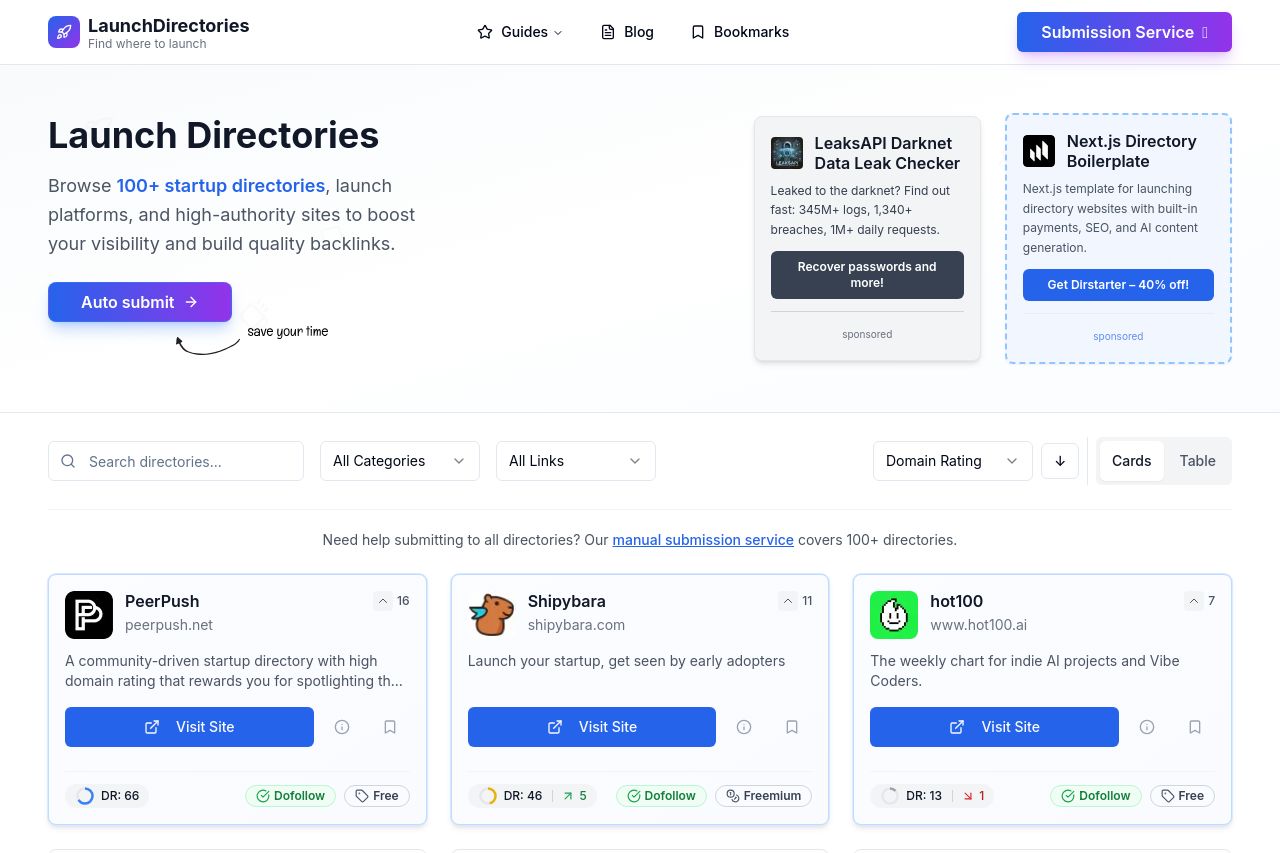
The page looks clean and modern, but the value it promises is fuzzy. the hero copy says “Launch Directories” and hints at discovery and backlinks, but the core benefit isn’t crystal clear: what exactly happens when someone uses this site? do they get submitted to 100+ directories automatically, or is it a directory directory with guidance? the CTA in hero is a bit vague too—“Auto submit” sounds technical and non-empathetic to a founder who just wants exposure. right rail sponsored blocks are visually separate enough to feel like ads, which muddies trust and draws attention away from the primary goal. there are some credible signals (featured logos, copy about building backlinks), but there’s no strong social proof or quantified outcomes (e.g., “X% increase in traffic” or “Y% higher backlinks”). overall, it communicates a generic benefit but fails to make a concrete, single-value promise, and the CTAs don’t clearly map to a buyer’s journey.
the Open Graph data can help click-through, but the title/description are long and a bit clunky for social preview. see OG feedback in the dedicated Feedback section.
In short: the concept is solid, but the messaging is undercooked, the hero CTA is murky, trust signals are underexploited, and OG data is not optimized for click-through. fix these and you’ll stop visitors from bouncing before they even scroll.
- Rewrite the hero value proposition to a single, repeatable promise: "Submit once, get listed on 100+ startup directories for higher visibility and valuable backlinks" with a visible subtext of outcomes.
- Replace or clarify the primary CTA to be more action-oriented and benefit-driven (e.g., "Auto Submit to 100+ Directories" or "Get Started Free Demo"). Place a secondary CTA for trust (e.g., "See how it works").
- Improve OG data immediately: shorten the description to 120–160 chars, emphasize a concrete benefit, and use a 1200x630 image with a clear brand presence and a strong call-to-action.