jonasfix.dk
Landing Page Analysis
IT-hjælp til hjemmet på hele Sjælland. PC, Wi-Fi, printer, mobil og TV. Telefontider man-tors 12-20, weekend 10-23. Ring 42 92 83 22.
Summary:
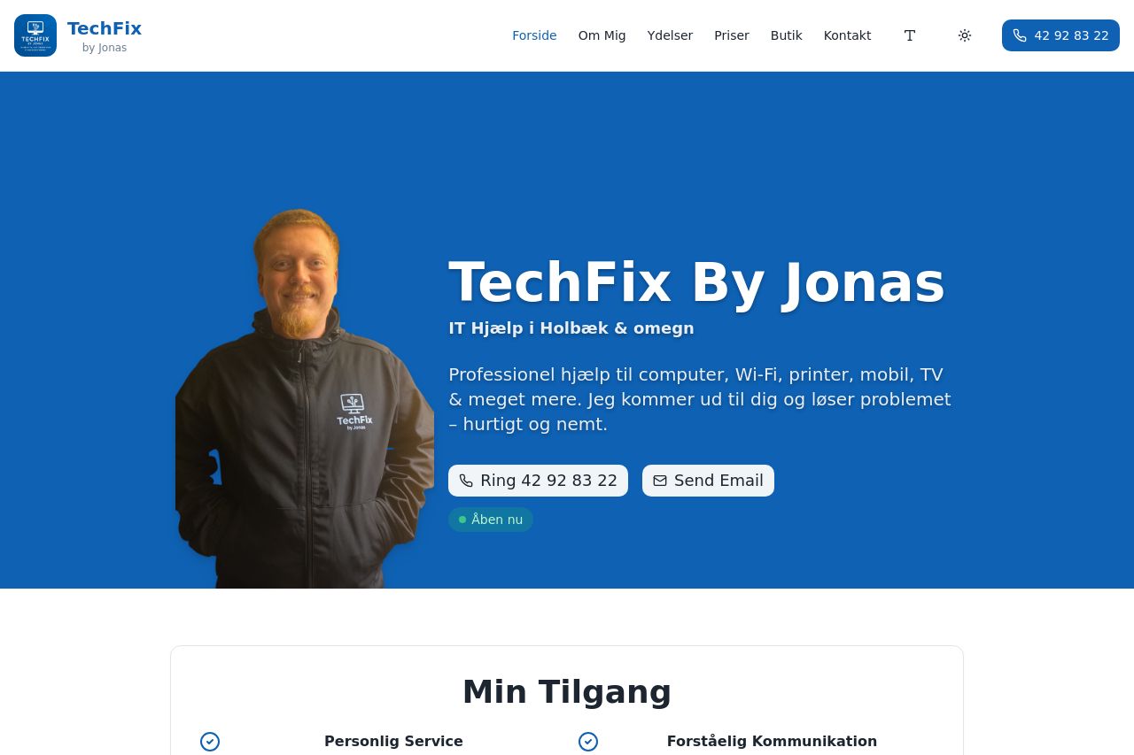
Bold hero, big type and strong contrast make TechFix By Jonas feel trustworthy at a glance. The layout speaks to an older audience with obvious contact CTAs, a friendly face, and clear service blocks. But there are real issues hiding in plain sight: the hero takes up a lot of vertical space, which can feel like a chore to scroll for seniors who just want quick answers. The main value proposition reads fine, but it could be crisper and more explicit about what it costs, how fast help arrives, and the benefits of choosing Jonas over a generic IT support service. The service tiles are visually neat, yet the copy under each tile is still a bit compact for an older reader and could use larger fonts and more generous line spacing. Trust signals are present but weak – there are testimonials and case visuals, but no strong proof of credibility like a physical address, a clear privacy policy, or recognizable client logos. The FAQ is useful, but the accordion approach makes it hard to scan quickly on mobile or for readers who lose focus easily. The contact form is comprehensive, which is good, but it may intimidate someone who just wants a quick call or a straightforward email. The bottom CTA bar is helpful, yet with multiple CTAs across sections there’s a risk of decision fatigue and distraction. Open graph data is reasonable but could be tuned for social clicks with a more compelling image and concise description. In short: confident design with good accessibility cues, but the page needs more clarity, stronger proof, simpler navigation for seniors, and better balance between information density and quick action.
- Clarify the primary value prop in one sentence at the very top and mention benefits like fast in-home help, simplicity for seniors, and no-jargon language.
- Increase the hero font size and line height for body text in the intro to improve readability for older eyes, and reduce the hero height so users reach the call-to-action faster.
- Add a dedicated credibility block near the hero (physical address, clear contact channels, a couple of client logos or recognizable affiliations) and optionally a short video testimonial to boost trust.
- Streamline CTAs: keep one primary CTA per section and make it visually distinct (large button, high-contrast color, and a verb-led label). For example after the hero: ‘Ring nu’ or ‘Se alle kontaktmuligheder’ as a single clear choice.
- Rework the FAQ to a simple, skimmable format for mobile (short questions visible, expand only when tapped) and ensure typography is legible with larger hit targets for seniors.
- Tune Open Graph: use a 1200x630 image of Jonas with a short, benefit-driven description (e.g., “Få hurtig IT-hjælp i Holbæk og omegn — ring nu”).