automationsmalta.com
Landing Page Analysis
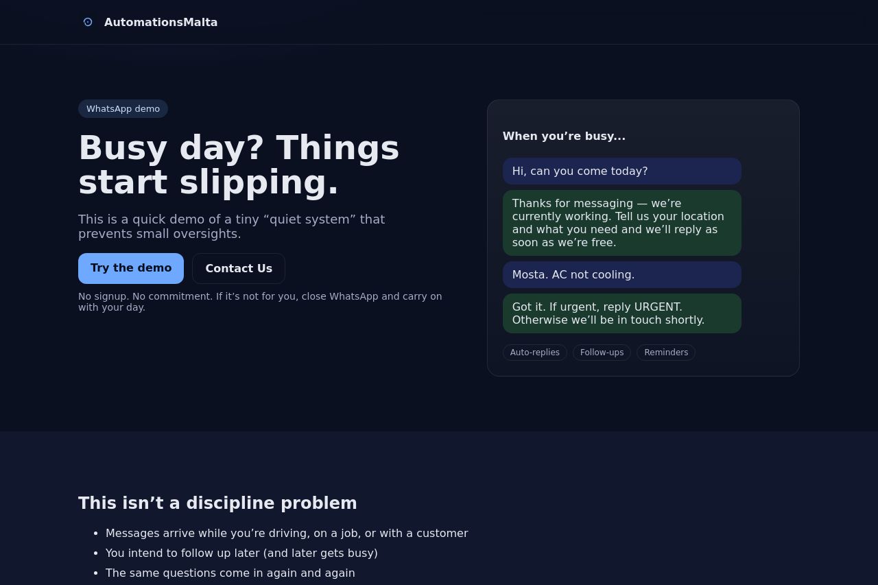
A short WhatsApp demo showing how small systems can prevent things slipping through the cracks.
Summary:
Dark, premium vibe, but the message is a mess. Bold hero and a slick right-hand chat card look great, but there’s zero clarity about what the product actually does for a small business day-to-day. The value proposition isn’t stated in a single, crisp line, and the hero copy meanders into a vague “tiny quiet system” idea without showing real outcomes. The right panel signals automation, but there’s no tangible preview or KPI promise. The rest of the page slides into generic benefits and pain points with no social proof, no pricing, no concrete use cases for the target audience. Visuals are strong, but the copy and structure fail to convert because the core offer is under-explained.
Overall, this page looks premium, but premium won’t close deals for busy small business owners who need to understand the payoff in 8 seconds. You need a clear value proposition, credible proof, and a single, obvious next step above the fold. Right now, the design sells mood, not results.
- Clarify the core value proposition in one sentence under the hero headline. For example: "Automate customer follow-ups on WhatsApp to reduce missed inquiries by 40% and speed up replies to under an hour."
- Show a concrete demo preview or short animation of how the system prevents oversights, not just a generic screenshot.
- Add credibility right away: one client logo, a testimonial, or a short statistic about speed/reduction in misses.
- Make the primary CTA unambiguous and dominant (e.g., “Get a Demo in 60 seconds”).
- Improve contrast and typography in body text to ensure readability on all devices, especially the hero copy.