startuups.com
Landing Page Analysis
Discover and upvote the best new startups launching every week. Join our community of founders and early adopters on startuups.com.
Summary:
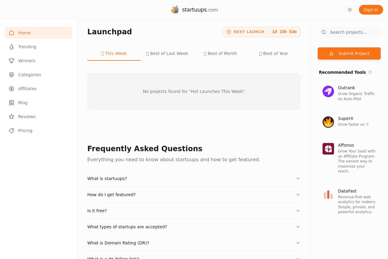
Startuups’ Launchpad looks clean and minimal, but the entire page reads like a cold, empty shell begging for content. The hero area is just the word Launchpad with a tabbed filter and an empty state message: “No projects found for Hot Launches This Week.” There’s almost no persuasive copy above the fold, no immediate demo or preview, and no obvious primary action to guide a first-time visitor. The left navigation is busy and visually heavy for a page that should funnel users toward discovery, while the right rail’s bright orange Submit Project CTA feels jarring against the otherwise soft, airy aesthetic. The Frequently Asked Questions section exists, but it’s generic and lacks substance to reduce hesitation or answer real buyer questions. In short: great look, zero urgency, zero guidance, and zero trust signals. You’ve built a pretty brochure, not a high-converting lead generator. There is a ton of whitespace and a simple structure, but there’s no narrative, no proof, and no frictionless path to action. If your goal is to get people to submit or to explore, you’re failing to provide the two things that matter most: a strong hook above the fold and a clear, frictionless path to the next step.
Open Graph already mirrors the core value proposition, but it isn’t leveraging a hook or social proof to persuade click-throughs. The image looks like a generic startup hero–adequate, but not irresistible for social shares. The title/description are descriptive but bland, and they don’t prompt engagement or curiosity. You should craft OG copy that promises a tangible benefit (upvote, discover, and follow the hottest launches) and pair it with a branded, high-contrast image that scales well across platforms.
- Rewrite the hero copy to give a crystal-clear value proposition above the fold (e.g., "Discover and upvote the hottest weekly startup launches"), plus a prominent primary CTA (e.g., "Browse Launches" or "Submit Your Startup").