bestboilerplates.com
Landing Page Analysis
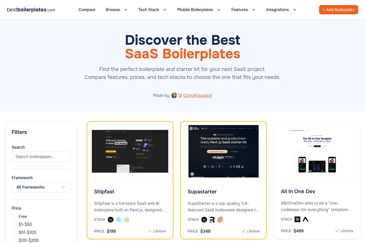
Find the best SaaS boilerplates and starter kits. Compare features, prices, and choose the perfect foundation for your next project.
58
Share on:
Summary:
62
Messaging
75
Readability
60
Structure
42
Actionability
68
Design
18
Credibility
Bold, clean directory vibe, and the hero copy nails the promise. But the page sacrifices clarity for a catalog vibe: no clear call-to-action above the fold, filters overpower the initial view, and the grid cards feel visually uneven. The FAQ/content sections drag on and disrupt flow, and there’s almost no credibility signals beyond a small author credit. The OG data isn’t explicitly on the page, so social shares may not convert well without optimization.
Main Recommendations:
- Add a prominent, above-the-fold primary CTA (e.g., “Browse boilerplates”) with strong contrast and a secondary action (e.g., “Compare features”).
- Tighten the hero subheading copy and introduce a concrete benefit or example to reinforce value immediately.
- Standardize card heights, borders, and hover states to create a cohesive grid that scales well across breakpoints.