costrym.com
Landing Page Analysis
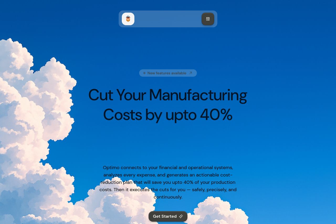
Optimo connects to your financial and operational systems, analyzes every expense, and generates an actionable cost-reduction plan that will save you upto 40% of your production costs. Then it execut
Summary:
Visually impressive hero with a bold, clouds-in-the-sky backdrop and a strong, oversized headline. The concept screams scale and modernity. But the page overreaches on clarity: the main value prop is vague, there are almost no social proofs or trust signals, and the long-form content in later sections kills scannability. CTAs exist but aren’t consistently placed or clearly tied to the user’s immediate needs. It’s a designer’s dream and a CRO nightmare at the same time: great visuals, mediocre to weak evidence, and too much noise before you get to a concrete offer or proof. You’ll convert more if you stop aiming for wow and start aiming for unmissable clarity, proof, and calls to action.
- Craft a single, crystal clear headline that states who it’s for and the exact, measurable outcome (e.g., Cut factory costs by X% using automated cost-cutting across procurement, energy, and operations). Place this above the fold with a concise subhead and a strong primary CTA.
- Add immediate proof on the hero (a short statistic, a logo wall or a short video/demo) and integrate trust signals early. Show at least 3 logos or 2-3 customer quotes above the fold.
- Increase scannability throughout. Break long paragraphs into bullets, reduce density in hero copy, and use consistent, aligned headings with clear CTAs after each major section.