validagenda.com
Landing Page Analysis
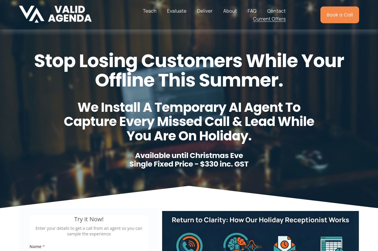
Closed for Christmas? Don’t come back to missed calls and unread voicemails. Our holiday receptionist captures enquiries and logs them for follow-up.
Summary:
The hero grabs attention with gigantic type, but the message is muddled by grammar and ambiguity. It promises a temporary AI receptionist to handle calls while you’re away, which is clear in concept but poorly distilled in copy. The page piles a form on the left, an infographic on the right, and a bold price claim, then tosses in two orange CTAs that compete for attention. Visuals are big and bold, but readability suffers due to dense copy, busy background, and inconsistent line lengths. Trust signals are thin (no client logos or case studies visible), and the bottom sections rely on a YouTube video rather than proof of results. Overall it communicates the core idea, but the positioning, tone, and hierarchy are messy and could be dialing in the value proposition, audience focus, and trust cues. The Open Graph data is decent but could be optimized for social sharing with a tighter title/description and a more branded image to improve click-through.
- Tighten the main headline to clearly state the benefit in one line (e.g., "Capture every missed call while you’re away with a temporary AI receptionist.").
- Fix obvious grammar: change 'While Your Offline This Summer' to 'While You're Offline This Summer' or similar.
- Reduce copy density in the hero: split long sentences, use bullets for benefits, and ensure the price/date line is clearly separated from the hero copy.
- Consolidate CTAs into a single primary action per screen area to avoid decision fatigue (e.g., after the hero, use one primary CTA and one secondary).
- Add credibility signals above the fold (client logos, a short testimonial, policy links) and ensure trust badges are visible near the form.
- Improve visual hierarchy: ensure headers, subheaders, and body copy use distinct sizes/weights; increase contrast between text and background; align content to a clean grid.
- Refine Open Graph: shorten the OG title to 50–60 chars, keep the description under ~150 chars, and swap the image for a branded 1200x630 image with your logo and a clear value prop.