turquoisenetwork.com
Landing Page Analysis
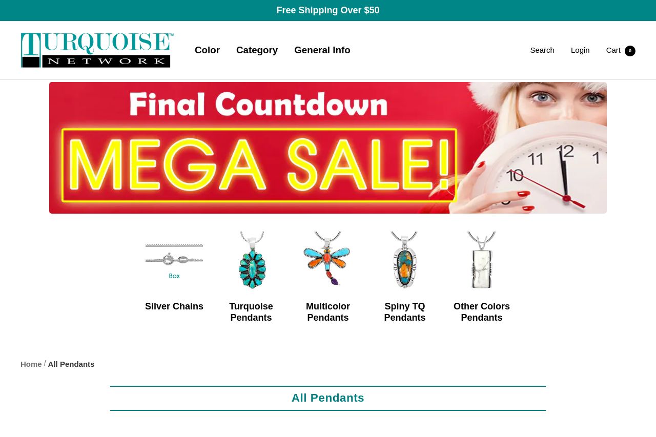
All Pendants
Summary:
Bold intro: this All Pendants page screams “discount first, clarity never.” The hero banner dominates the fold with a generic Final Countdown Mega Sale vibe, but it never answers the core question buyers have here: what makes these turquoise pendants special enough to buy today? The grid is a scroll of product thumbnails with prices, but no obvious value proposition, no sorting or filtering, and almost no guidance on which pendant fits which occasion. The category chips above the grid help a bit, but they don’t solve the main UX problem: buyers want to understand differences fast and want a clear path to checkout. The visuals are bright and crisp, but the messaging is thin, and the CTAs are nowhere to be found on the product tiles. In short: lots of products, little guidance, weak trust signals, and no single, persuasive reason to buy right now.
What stands out in a bad way is the lack of filtering/sorting, the cluttered page height (hero dominates, then a long grid), and product titles that are long and poorly spaced, making scanning painful. The footer area is busy and visually heavy, which detracts from the shopping flow. There’s no explicit guarantee, no reviews, no about-us clarity, and no guarantee that customers even know what distinguishes these turquoise pieces beyond price discounts.
If you want a fast-win, you need a killer hero value proposition, clearer CTAs, better product typography, and real trust signals. Right now, the page feels like a catalog dump rather than a guided storefront.
- Create a single, crystal-clear value proposition in the hero (e.g., "Timeless turquoise pendants crafted in sterling silver—durable, stylish, everyday wear") and repeat it near the grid.
- Add a visible primary CTA on product tiles (e.g., “Add to Cart” or “View Details”) and a consistent hover CTA, so readers can act without hunting for buttons.
- Implement basic filtering/sorting (price low-high, popularity, newest) and offer quick view to reduce clicks to checkout.
- Integrate trust signals (reviews, star ratings, shipping/return policy highlights) above the fold to boost credibility.