lovable.app
Landing Page Analysis
Build software products, using only a chat interface

Summary:
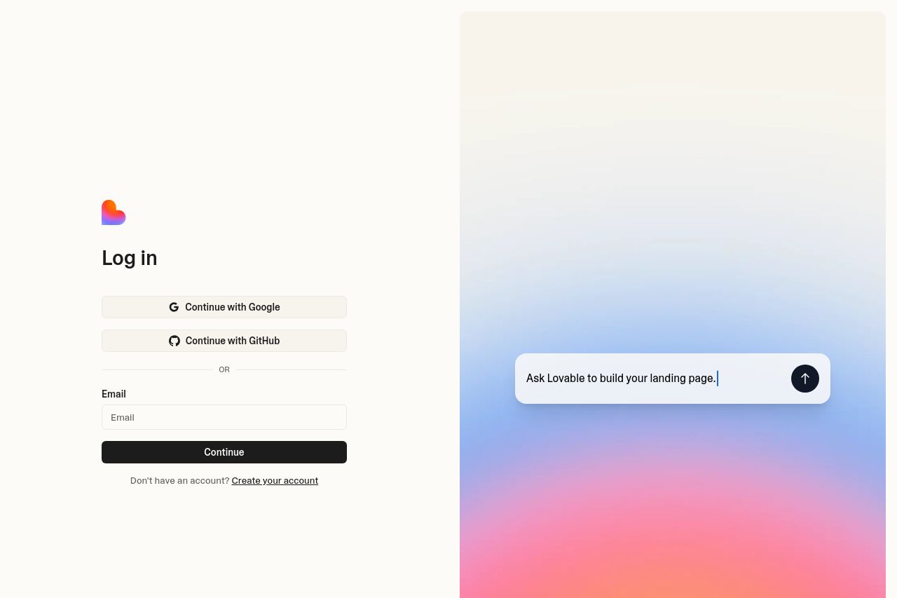
Two-column aesthetic looks premium, but the page is hiding a product message under a login form. For a landing aimed at musicians, producers, beatmakers, there is zero music-specific positioning here. The left panel screams “log in to your account” with a generic signup line, while the right side flaunts a glossy gradient and a vague CTA about building a blog. The result is confusing: visitors don’t instantly understand what Lovable does for them or why they should care. The open-space, minimal copy works aesthetically, but it borders on a misalignment between form and function. If you’re targeting artists, you need a compelling value proposition up top, not a sign-in gate. The OG image is visually strong, but the on-page copy never anchors it to musician use cases, so the user experience feels like a detour rather than a purchase path. The overall effect is: pretty, but not persuasive or targeted. Great visuals, terrible clarity for the core audience.
What to fix first: swap the login focus for a performance-driven hero that speaks musician language, add explicit use cases (beat stores, artist pages, tour merch, sample packs), and present a primary CTA that aligns with the action you want users to take instead of “Continue”.
- Replace the left login form with a musician-focused hero headline and subheading (e.g., "Build music sites and merch experiences with chat, not code"), and use a strong primary CTA like "Start building your music site for free".
- Add musician-specific use cases and visuals (e.g., embed beat store, artist page, tour merch) below the hero to show relevance within 3 seconds.
- Convert the right-side gradient panel from a decorative element into a concrete, testable CTA or product demonstration (e.g., a live-demo panel that shows how chat builds a page for a music blog).