a1posters.store
Landing Page Analysis
Share your story about what makes your shop unique. Tell customers about your products, your passion, and what sets you apart from the competition.
Summary:
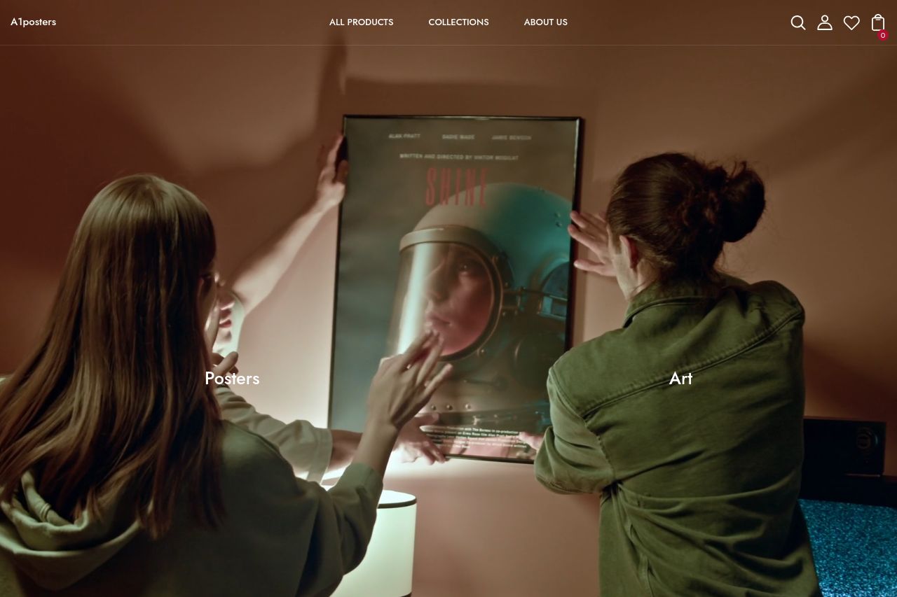
the page looks polished at first glance, like a real shop for art posters, but the UX and copy are a mess and the structure is half-baked. visually it nails a premium vibe with big hero imagery and lots of white space, yet the copy is inconsistent (awkward lines like “The right mood for you life”) and there are hints of broken content (see FAQ rows and stray words). there’s a decent discovery path with categories (Colors, Themes, Rooms, Collections) and a grid of products, but there’s no strong, obvious reason to buy on the first fold. trust signals are scarce, and the hero lacks a clear action to grab conversions. overall it’s promising but conversion-grade polish is missing: tighten messaging, fix content integrity, add clear CTAs, and shore up credibility before expecting strong sales lift.
- Make the hero sell the benefit first and add a prominent, action-oriented CTA (e.g., “Shop All Posters” or “See Collections”) above the fold with high-contrast button styling.
- Fix copy integrity across the site (correct grammar like “The right mood for you life,” ensure consistent tone, and remove stray words like “erter”).
- Add trust signals on the homepage (customer reviews, logos, or a small “Trusted by customers” badge) and show at least one founder or company detail to boost credibility.
- Improve FAQ and footer content to avoid repetition and broken text; ensure accordions function and copy is clean, helpful, and unique.
- Optimize product grid with consistent card layouts, visible prices, and quick filters to speed up shopping.