logodesign.dk
Landing Page Analysis
Få designet et logo der afspejler de relevante værdier. Jeg har designet logo for ca. 300 virksomheder. Se her hvordan.

Summary:
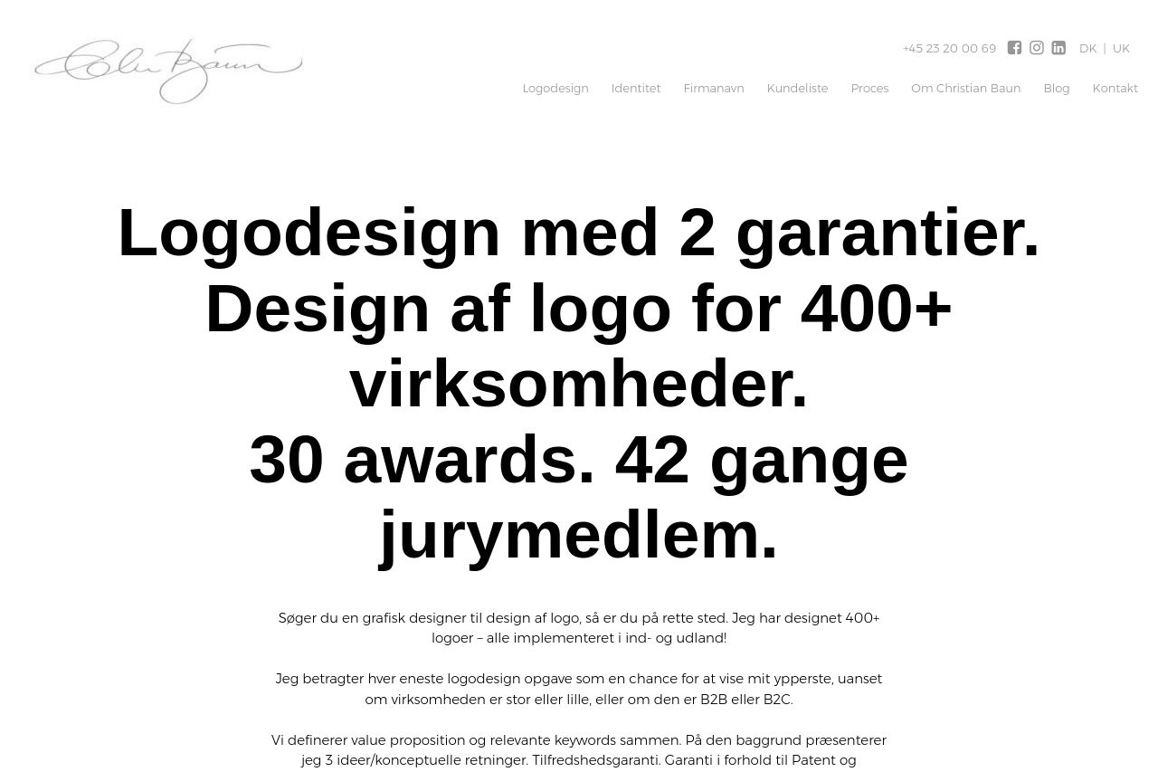
This page is all about big typography and a gallery of logos, but the value proposition is foggy and the UX suffers for a busy B2B audience. The hero copy is a wall of text that tries to sound impressive but it isn’t crystal clear what you actually offer, who it’s for, or what the customer gets. The gigantic Danish headlines look bold, but they overwhelm the page without delivering scannable benefits or a single, obvious next step. The logo grid below is visually striking, but it reads like a portfolio dump rather than a guided conversion path—no concrete case studies, no pricing, and no clear CTA. The body copy that follows is dense and lacks scannability, with long paragraphs and minimal visual hooks. Overall you’ve got personality and trust signals (awards, jurymembers, big numbers), but none of it is organized into a crisp, scannable journey for a busy decision-maker. And the Open Graph data? N/A. That’s a missed chance to capture clicks when the page is shared. You need to stop shouting and start guiding.
Summary: you can look premium, but you’re not helping a B2B buyer understand what they get, when they get it, or why they should care right now. If you want to close more deals, you need a tighter value proposition, a clearer path to contact or demo, and scannable benefit-driven copy sprinkled with trust signals.
- Rewrite the hero to include a single clear value proposition with concrete benefits (e.g., "I design logo identities fast for growing B2B brands with a 2-year guarantee and a 30-award track record"), plus a short subhead that defines the target audience.
- Add a primary CTA above the fold (e.g., "Get a Quote" or "See a Quick Preset Design"), and place a secondary CTA nearby (e.g., "View Case Studies").
- Convert the logo grid into a navigable gallery with captions or links to case studies, so it supports storytelling instead than just decoration.