preview-beefree.space
Landing Page Analysis
Los Angeles
Summary:
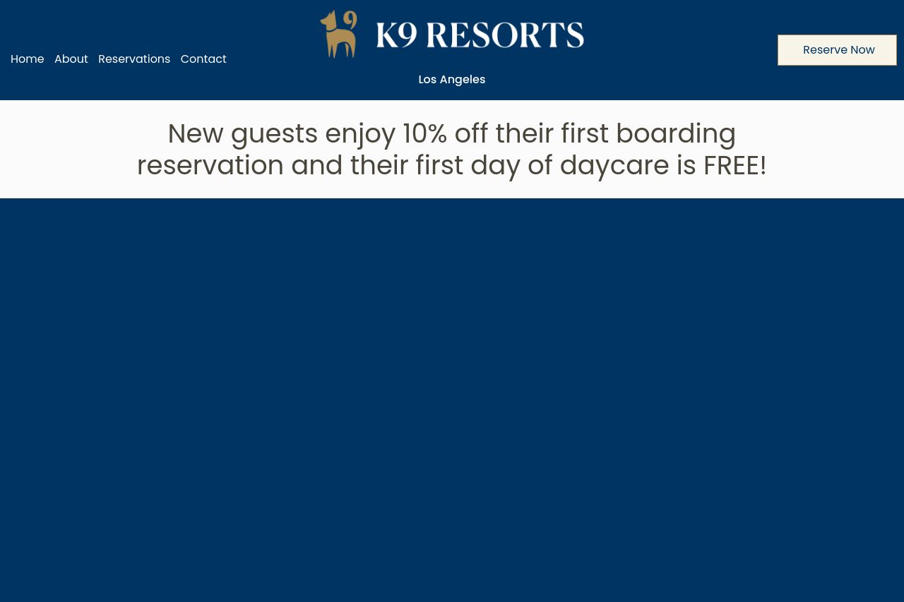
This page feels like a bold color palette trapped behind a messy information flow. the brand color is strong and the header looks trustworthy, but the fold hogs all the attention with a generic discount claim that isn’t reinforced by the rest of the page. the hero messaging shifts between “discounts” and “accommodations that feel like home,” which creates cognitive load and leaves visitors unsure what to do first. imagery is serviceable but the rhythm is off: big blue blocks, then beige strips, then image-heavy sections, all fighting for attention instead of guiding the eye. there’s enough content to confuse a first-time visitor who just wants to know price, availability, and a clear buy/booking action. the Open Graph data is missing, which hurts shareability and click-through from social. overall, the page has potential, but it needs a single, crisp narrative, tighter typography, and a more reliable conversion path.
Key issues to fix first:
- crystallize the value proposition above the fold and keep it consistent through the hero and pricing/tours
- establish a clean visual hierarchy with consistent typography and spacing
- fix Open Graph tags so social shares actually look inviting
- add solid social proof near the hero to build trust early
- ensure CTAs stand out and are placed where users expect them to act
If you want a quick win, start with the hero: a single headline, a brief subhead, and a single primary CTA that matches the next section (e.g., Check Availability). Then flatten the rest of the page into a logical journey: who this is for, why it’s better, what they’ll get, and how to book in 2 clicks.
- Define a single, crystal-clear value proposition in the hero and repeat it in the first 2 sections. e.g., "Luxury dog boarding near LAX with 3 guaranteed comforts and early booking discounts. Book your stay in 60 seconds."
- Create a strict visual hierarchy: limit to 2–3 font scales, ensure headings clearly stand out, and make CTAs clearly distinguishable with color and whitespace.
- Set up Open Graph tags: og:title, og:description, og:image (1200x630 preferred), and alt text. Use a concise, benefit-focused description and a strong image that represents the service.