co.nz
Landing Page Analysis
Trusted immigration adviser NZ offering expert Immigration Services NZ. Get personalized visa guidance, compliance support, and fast approvals. Visit now!!
Summary:
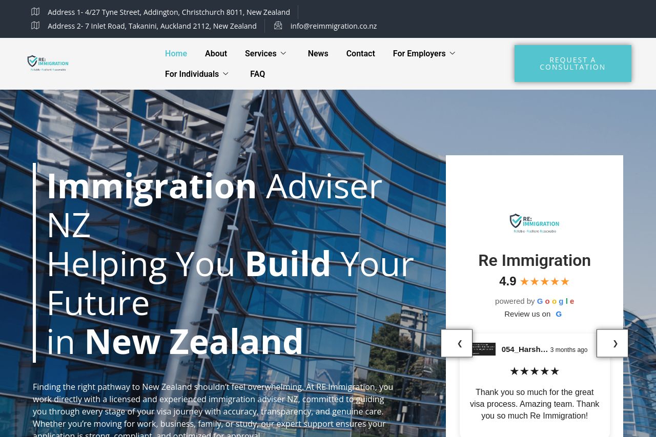
This page looks sharp at first glance, but it’s a mess under the hood. The hero is visually bold and the blue-teal accents pop, but the big white-on-photo text fights readability and the floating right-hand card (with the logo and Google rating) blocks part of the hero, making the first impression feel cluttered. The navigation is straightforward, but the header area at the very top (addresses and email) reads like dead-weight noise that distracts from the main message. The content after the fold is a mixed bag: a strong “Our Services” grid, but the layout jumps between full-bleed imagery and dense text blocks, which hurts cohesion. The overall brand vibe is consistent, but the page doesn’t funnel visitors toward a concrete action beyond a single CTA: “Request a Consultation.” There are credible signals (testimonials, logos, Google rating), but they’re not executed with a clean, scannable path to conversion. The Open Graph data you supplied belongs in the feedback section below; as-is, it’s generic and doesn’t reinforce the page’s unique value proposition. If you want a quick win, you need tighter typography, better readability, and a more linear journey from hero to services to a clear conversion point. Now is the time to tighten spacing, simplify hero messaging, and ensure every section nudges toward a concrete next step rather than leaving users to improvise.
- Rework the hero: add a dark, semi-opaque overlay or a subtle gradient to boost contrast for the headline and subhead. Make the main value proposition scannable in 1–2 lines.
- Move the right-hand trust panel lower or below the fold so it doesn’t compete with the hero text. If kept, ensure it doesn’t obstruct the primary headline or CTA on smaller screens.
- Create a simple conversion path beyond the single CTA: add a secondary CTA near the hero (e.g., “See Visa Options” or “View Our Services”) and a 2–3 bullet value prop right under the hero to anchor benefits.