alphagenanalytics.ai
Landing Page Analysis
Created with Figma

Summary:
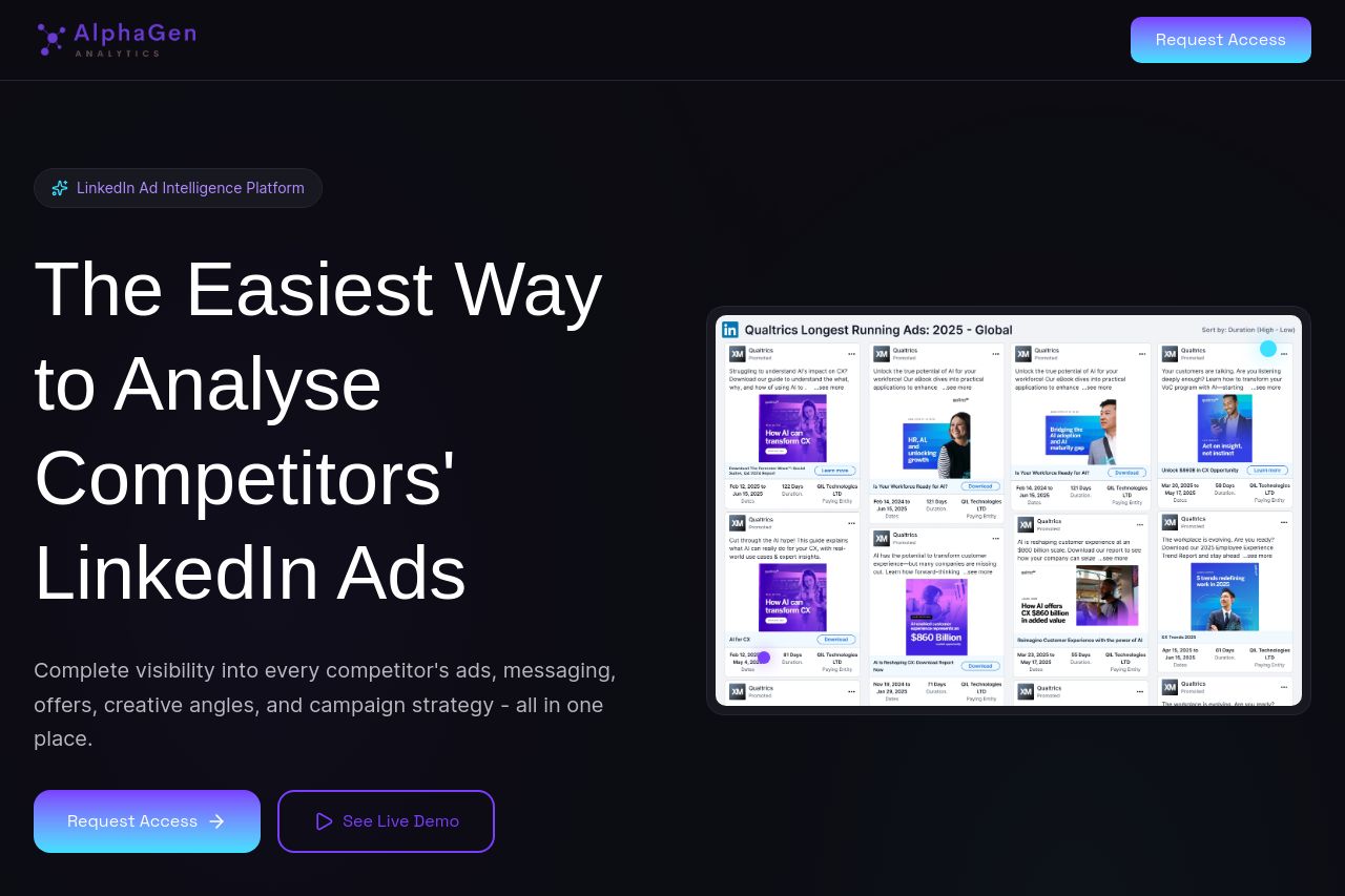
Dark, premium vibe with big typography and a bold CTA — it screams “enterprise” and premium tooling.
The hero nails the core idea—watching competitors’ LinkedIn ads in one place—but the subcopy is long and a bit generic, which can dilute the hook. The value prop is clear enough: you’ll get visibility into ads, messaging, and creative angles. The layout is visually strong: left-aligned headline, a big screenshot/video on the right, a glowing primary CTA, and a secondary ghost CTA. Trust signals exist but feel a bit timid (logos and “Trusted by” appear lower in the fold).
The sections that follow attempt to explain features with bullets and iconography, which is good for scan-ability, but some copy is dense and could be tightened for faster comprehension. Pricing is visible but the early-access note may alienate impatient buyers. Overall, the page communicates premium capability but it could be sharper on immediate benefits, more concrete use cases for LinkedIn advertisers, and more explicit proof points (case studies, outcomes, or tangible metrics).
Bottom line: strong visual presence and credible framing, but copy clarity, proof of impact, and CTA discipline could be much tighter to convert faster from LinkedIn ads teams.
- Clarify the main value proposition in a single, punchy sentence above the fold (e.g., "See every competitor’s LinkedIn ad in one place and optimize your own campaigns in hours, not days").
- Reduce boilerplate in hero subcopy to a 2–3 line benefit statement with concrete outcomes (e.g., "+X% faster wins, Y% gained visibility").
- Add a visible, specific case or demo result near the hero (a small stat card like "13x faster ad insights in 7 days").