ahaslides.com
Landing Page Analysis
Learn why AhaSlides interactive presentation platform is the most comprehensive alternative in the market for businesses and educators compared to other options
Summary:
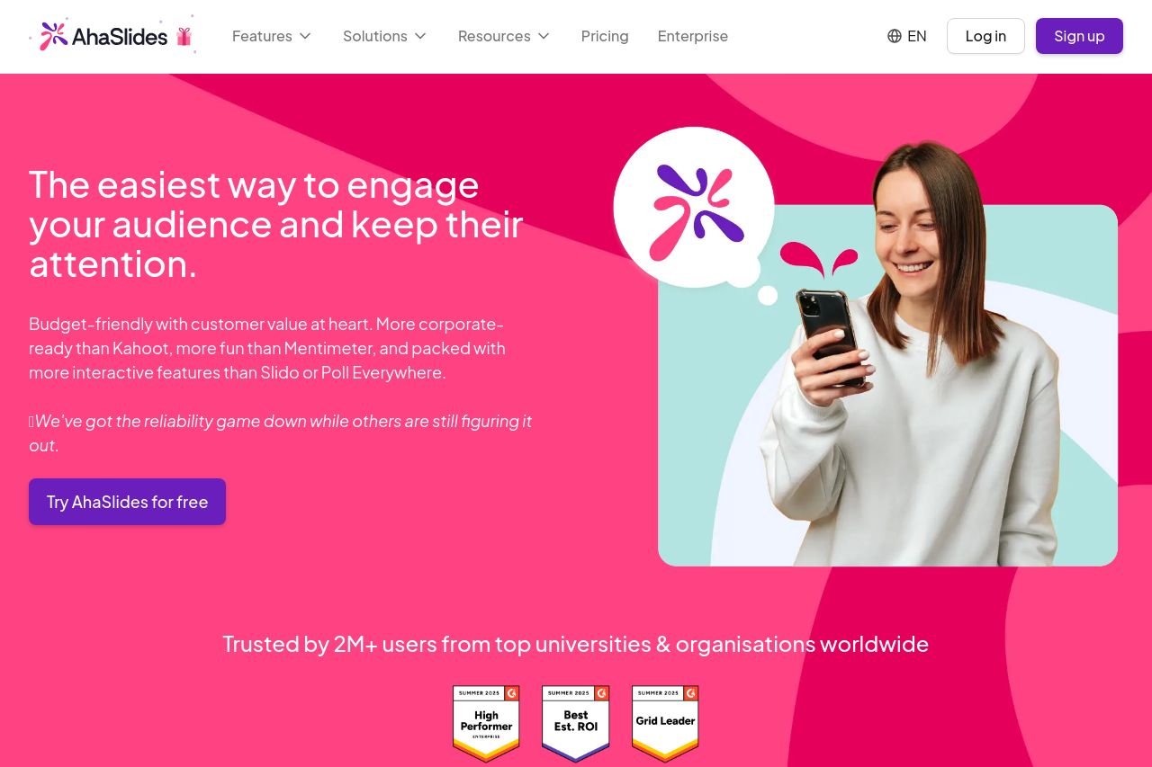
Bold, high-energy branding with a memorable pink / purple vibe.
The hero immediately screams “come play,” which is great for a B2C SaaS, but the page is too busy too fast. The main value prop sits in a big sentence, yet the subtext is cluttered with product-y buzz and numbers that don’t land for a casual reader. The navigation is cluttered for a landing page and the pricing signals aren’t crystal clear above the fold. Credibility signals (logos, awards) help, but there are no concrete customer stories or vivid outcomes. In short: the look is strong, the message is not consistently persuasive, and the information architecture fights the user rather than guiding them. The result is a brand feeling-first experience that’s visually striking but not immediately trustworthy or actionable for a typical buyer.
There are moments of strength—consistent color, clear CTAs, and social proof—but they’re buried under long paragraphs, questionable hierarchy, and mismatched section priorities. If you want to convert, you need to ruthless prune, tighten the UVP, and simplify the path to value for a B2C audience.
- Trim the hero: replace the long subhead with a single strong benefit plus a quick demo or example of interactivity, and place the primary CTA above the fold.
- Rework the pricing area: present a concise 3-column plan table or a simple comparison block with a single primary CTA per plan; add a one-line feature bullet per plan and highlight the recommended option.
- Strengthen credibility with real-world proof: add short customer quotes or mini-case studies near logos, enlarge logos for readability, and provide a link to testimonials or case studies.