youngglobal.co
Landing Page Analysis
United States 866 Wilshire, 2nd Street Los Angeles 90024.
Summary:
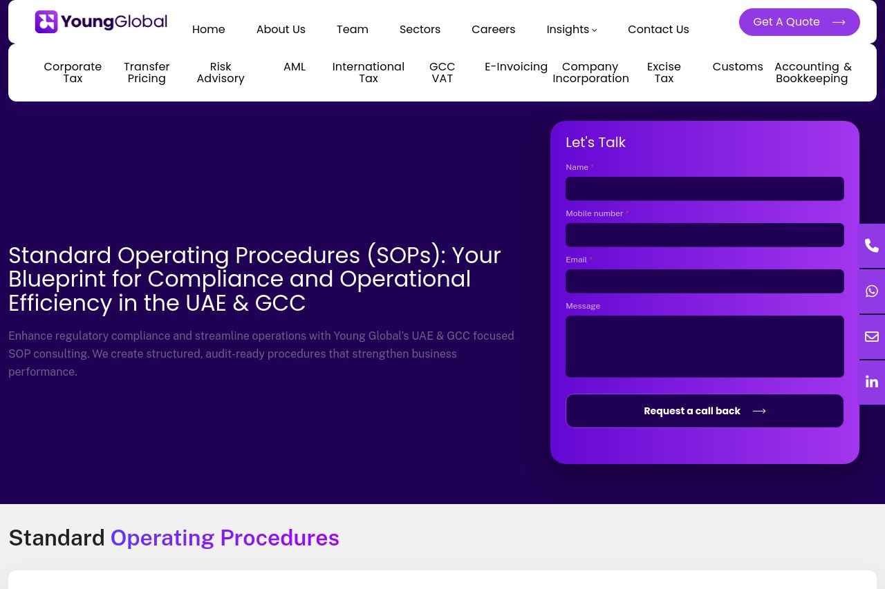
Bold move going purple and trying to look premium, but the page shoots itself in the foot with messaging chaos and a visual setup that overpromises and underdelivers. The hero screams a strong brand moment, yet the main value proposition is buried in a long, somewhat generic line about SOPs for UAE & GCC. The header is a monster: a white nav bar loaded with dozens of services, which makes the user’s top-of-funnel decision fatigue worse before they even know what you actually sell. The right-side form is visually prominent, which is good for conversions, but it competes with the hero text and creates a jarring, unbalanced fold. The content below the fold is a wall of text—blocky, dense, and not easily scannable—which kills readability. FAQ and “Our Approach & Advantages” sections exist, but they’re not distilled into crisp, sale-ready benefits. The site oddly treats trust like an afterthought: the footer shows an address and contact, but there are no clear testimonials, logos, or case-study proof visible in the hero area. The Open Graph data is minimal: Title present, but no description and no image, which hurts social sharing and click-through quality. Overall, you have the pieces of a strong brand, but the execution is a messy blend of noise and missed opportunities. You need a laser-focused proposition, scannable benefits, and cleaner CTAs rather than a carnival of sections that compete for attention. Getting the message right and aligning the experience with the actual buying journey should be your north star, not more chrome. Bold visuals can win, but not without sharp, visible value first.
Open Graph data gap: only a Title exists (Young Global) with no description or image. That hurts social sharing and click-through from links. Fix that by adding a compelling meta description and a share-friendly image that reinforces the SOP and UAE/GCC focus.
- 1) Distill the hero: replace the long headline with a single crisp value proposition and a supporting subhead that states a tangible outcome (e.g., "Streamline regulatory SOPs for UAE & GCC in 4 steps, with auditable templates and faster compliance timelines."). Add a clear primary CTA above the fold (e.g., Get Your SOP Audit Now) and limit the header to essential nav items to reduce cognitive load. 2) Improve readability and scannability: break the hero/subsequent sections into scannable chunks with subheads, short paragraphs, and 3-5 bullet benefits per section. Use icons next to each advantage; avoid walls of text in the Our Approach & Advantages section. 3) Clean up CTAs and distractions: unify CTAs so there’s a single primary action per section. Remove or minimize persistent floating utility widgets that obscure content on mobile. Ensure CTAs use strong verbs and visible contrast (e.g., dark CTA button on a lighter purple gradient).