manusa.com
Landing Page Analysis
En Manusa somos líderes en fabricación e instalación de puertas automáticas. Te ofrecemos diseño y alta calidad a precios competitivos.
72

Share on:
Summary:
84
Messaging
72
Readability
72
Structure
48
Actionability
84
Design
48
Credibility
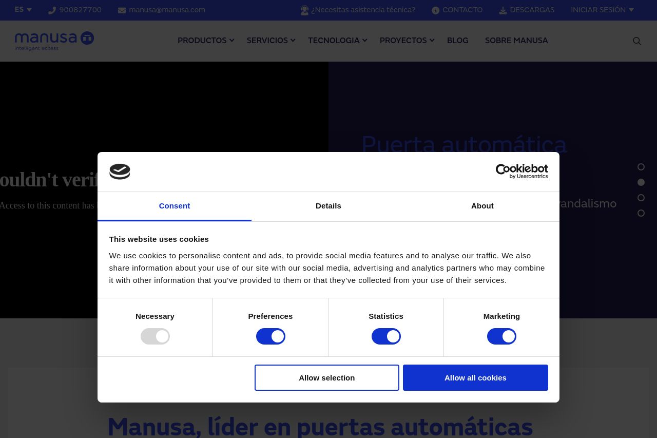
The page looks solid branding-wise and the blue/white Manusa aesthetic lands in the B2B vibe, but the user experience is dragged down by a monster cookie modal that dominates the screen. The hero content hides behind the overlay, so the core value proposition is hard to grasp at first glance. Open Graph data is present but incomplete (image not accessible), which hurts social sharing credibility. Overall, you have a clean visual language and credible backbone, but there are clear UX blockers and a language mismatch in cookie copy that undermine professional trust for a B2B audience.
Main Recommendations:
- Shrink or delay the cookie modal so visitors can at least glimpse the hero value proposition before asking for preferences.
- Fix OG image accessibility and ensure all metadata aligns with the Spanish-language page to avoid confusion in social shares.
- Make the value proposition crystal clear in the hero area with a concrete benefit statement and a visible demo/use-case example for decision-makers in target industries.