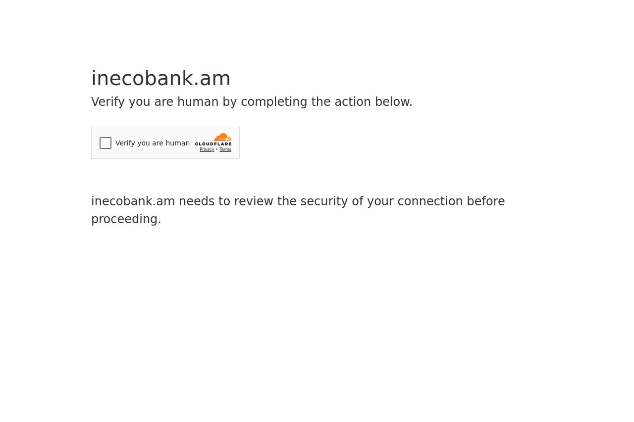
inecobank.am
Landing Page Analysis
Verify you are human by completing the action below.
Summary:
This isn’t a landing page at all. It’s a Cloudflare CAPTCHA gate that blocks access before you see any product, benefits, or proof of value. For a B2C bank, that’s a terrible first impression. There’s almost no messaging, no hero, no trust signals, and essentially no path to conversion. The only visible copy is a barebones invitation to verify you’re human, with a ton of whitespace and a vague security notice. It feels like a dead end rather than a storefront. Worst of all, there’s no branding or grounding context to tell users what ineconobank.am even offers beyond a blocked screen.
In short: functional security gate, terrible UX for a consumer site, zero onboarding or value communication. If the goal is to build trust and drive signups, you’re miles off the mark here.
Ray ID and Cloudflare branding are the only “proof” you give users that you’re real, which isn’t enough to reassure a first-time visitor who wants to know what you do and why they should care.
- Remove the initial CAPTCHA gate from the fold so users see a value proposition and branding before any friction. If bot protection is required, implement it behind a lightweight preload or after user intent (e.g., after clicking a CTAs).
- Add a clear hero with a concise value proposition for consumers (e.g., local banking, easy transfers, secure deposits). Include a prominent, benefit-driven CTA.
- Show trust signals early (privacy policy, security measures, user reviews/logos) and provide a visible path to onboarding rather than a blank, security-only screen.