skims.com
Landing Page Analysis
SKIMS is a solutions oriented brand creating the next generation of underwear, loungewear and shapewear.
Summary:
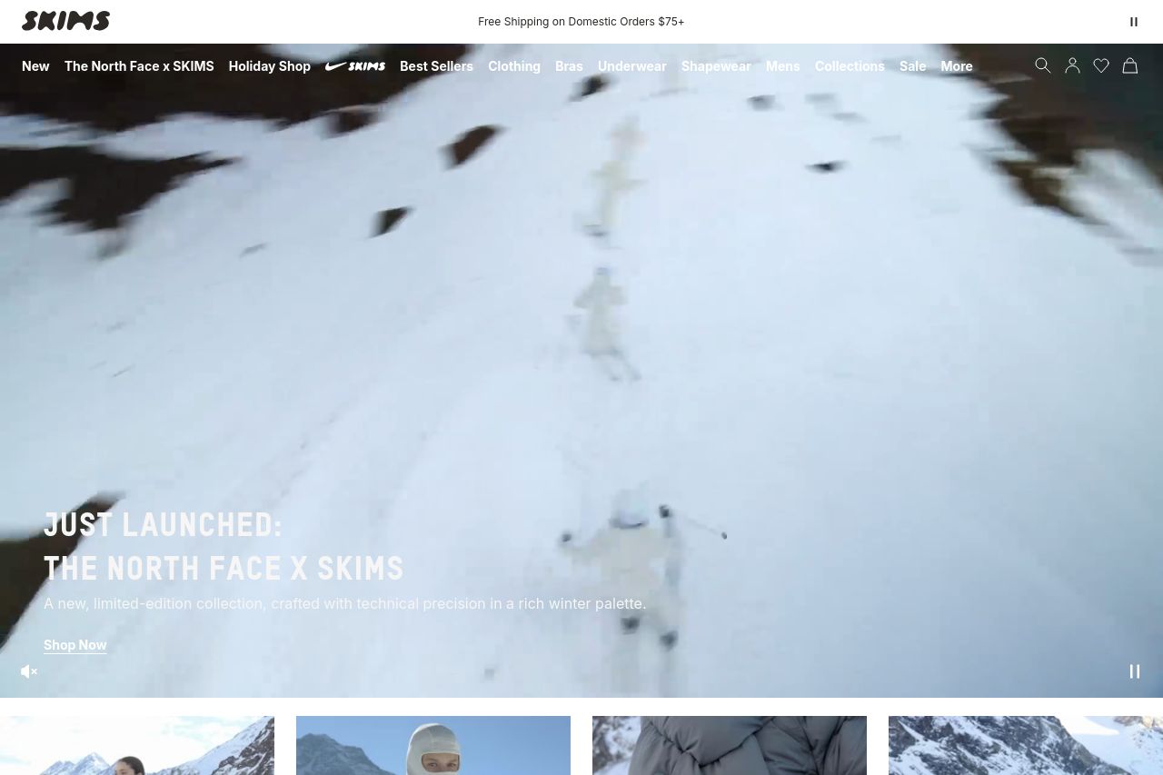
Open Graph snapshot shows a strong positioning promise: “SKIMS | Solutions For Every Body” paired with a description claiming the brand is a solutions oriented line for underwear, loungewear and shapewear. that’s a clean, inclusive signal and sets a legit frame for what the product should do. the downside in the data we have is surface-level: it signals purpose but gives no concrete proof points, no tangible benefits, and no audience-specific framing beyond the blanket “every body.” that gap makes the promise feel vague to a first-time visitor. also, the metadata hints at a visual story (image metadata absent here) but the available data doesn’t show any supportive proof points or real-world use cases, which weakens trust early on. the cookie banner at the bottom and the stuck-hero feel seen in the visuals (even from the capture) threaten the first impression and risk a quick bounce before the value proposition lands. in short: the positioning language is solid, but the metadata and on-page storytelling don’t supply the concrete, believable evidence users need to buy in right away.**
- Explicitly pair the main promise with 3 concrete benefits on the hero (e.g., fit across body types, comfort, durability) and mirror those benefits in the meta description so social previews reinforce the value.
- Add explicit audience language in the hero copy (e.g., “for all body types, sizes, and activities”) to sharpen alignment.
- Improve the visual storytelling in the hero by including a quick-use case or product example alongside the promise to provide tangible proof points.