wpuserregistration.com
Landing Page Analysis
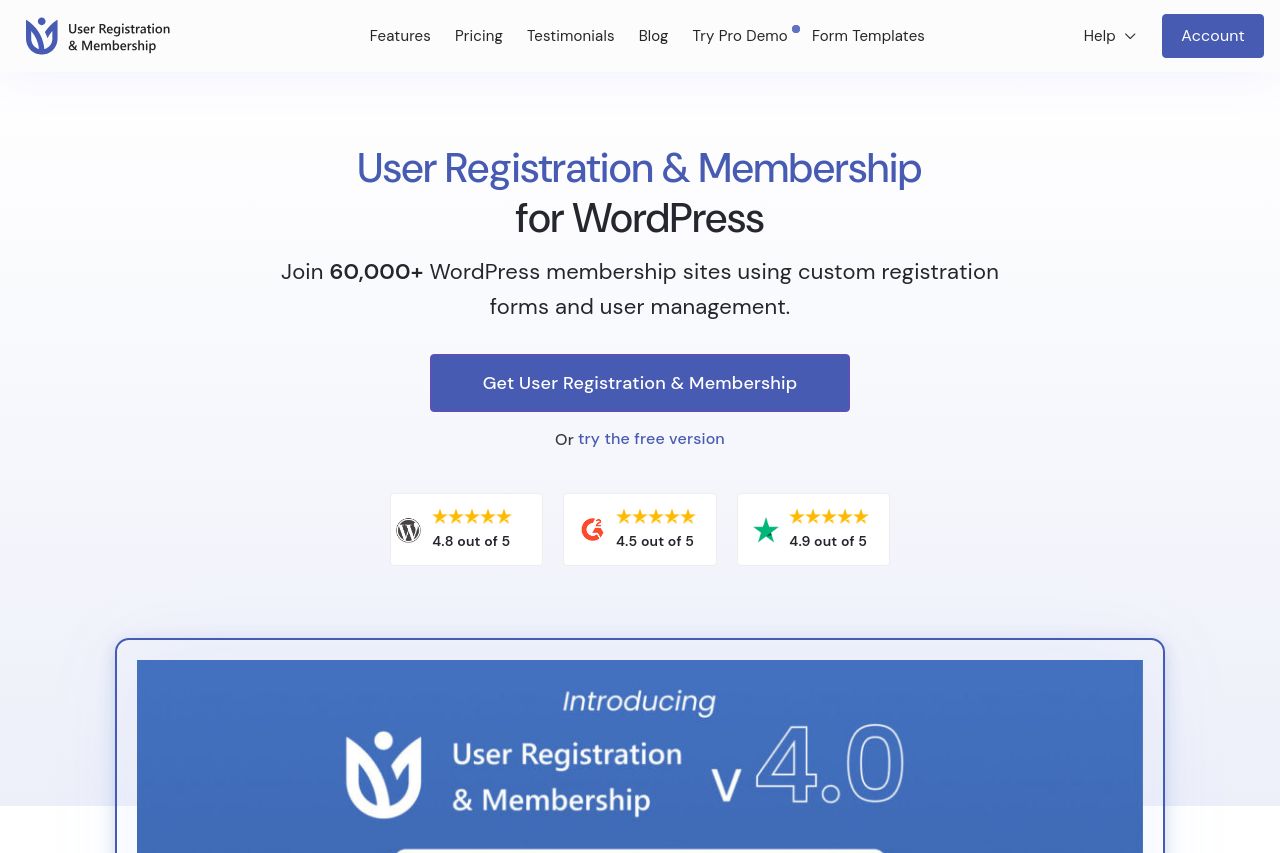
Create membership sites with custom user registration forms. Form builder, payment processing, and member management. Trusted by 60K+ WordPress sites.
Summary:
The page tries to scream “pipeline to subscriptions” but ends up reading like a catalog of features rather than a crisp promise. The hero nails the core idea (WordPress user registration and membership), but it doesn’t sell a unique benefit early enough—what makes URM faster, cheaper, or simpler than the competition? The copy in later sections drifts into product bullets without tying them to concrete outcomes for a specific audience. Visuals are polished and the grid layout reads clearly, yet the density of sections creates a battleground where the main value proposition gets buried. Trust signals exist (some customer quotes, “60,000+ WordPress sites” stat), but there’s no obvious path to validation (case studies, logos, or live demo). CTA language is functional but not persuasive enough to counter a sea of competing features; you need a single, unmistakable primary CTA on every fold and headings that clearly connect each section to a concrete benefit. The Open Graph data, if left as-is, risks underperforming social shares because the description is generic and the image lacks social-optimized dimensions and text. Overall, the page looks credible and comprehensive, but it needs sharper alignment between promise and outcome, scannable benefits, and stronger social-proof hooks to push visitors from curiosity to trial.
Key quick fixes:
- Lead with a single, crystal-clear value prop in the hero (benefit first, feature second).
- Add 2–3 audience-specific use cases in the hero or subheads.
- Introduce credible social proof early (logos, case studies, quantified results).
- Simplify and standardize CTAs: one primary CTA per screen, with a secondary option that complements it.
- Optimize OG data: same headline as the page, benefit-rich description, and a correctly sized social image with branding and a CTA.
- Break long sections into scannable blocks with bullets and concrete outcomes.
- Ensure consistency in typography and iconography to support visual hierarchy and readability.
- Rewrite the hero to emphasize a tangible outcome (e.g., “Launch paid membership sites in under 10 minutes with drag-and-drop forms”).
- Add 2 crisp customer use cases or industry-specific examples (e.g., membership sites for creators, coaches, or clubs).
- Fix Open Graph by: using a 1200x630 image with a short benefit statement and a strong CTA, plus OG tags: og:title, og:description, og:image, og:url.