landinganalyze.com
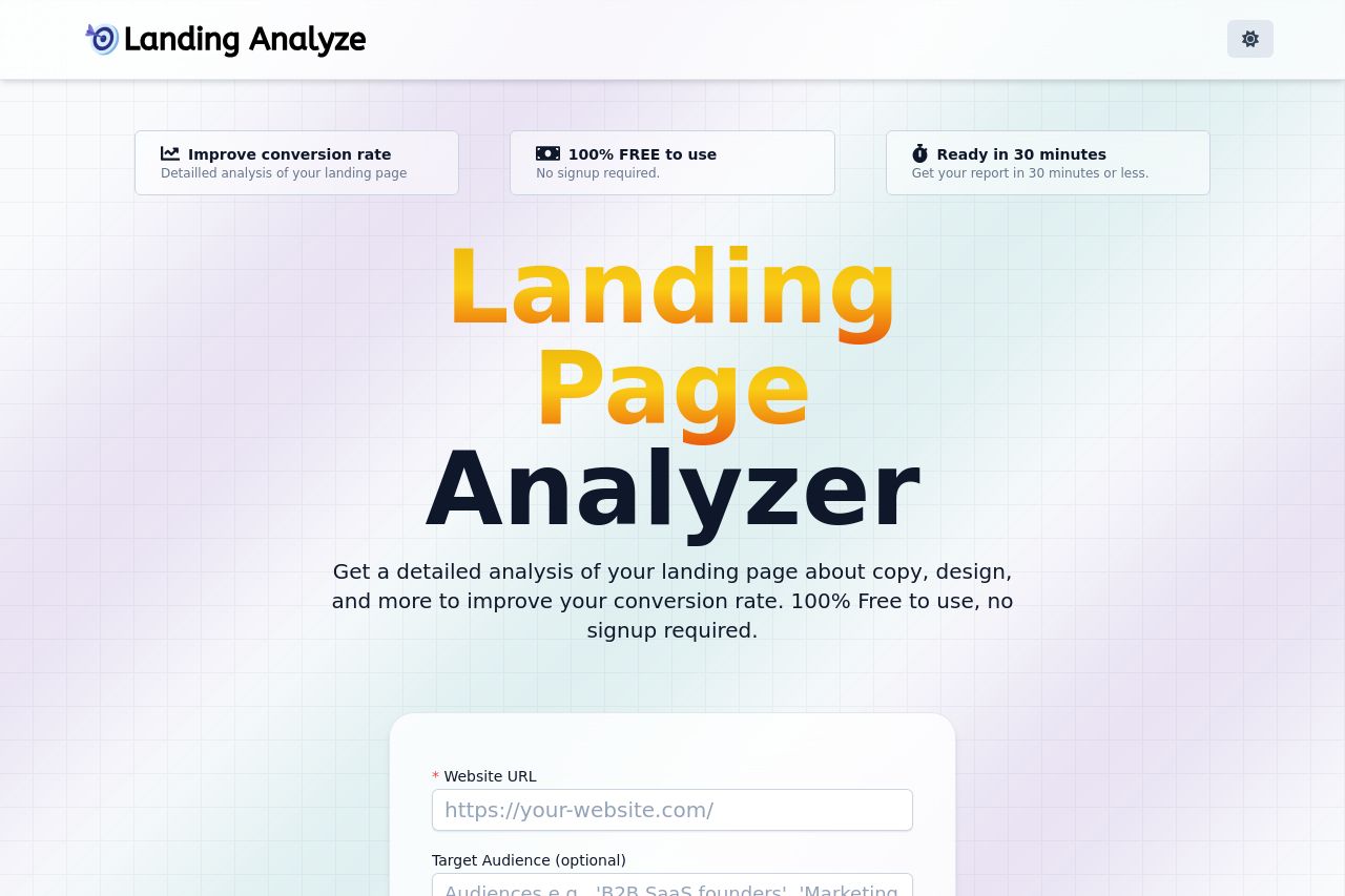
Landing Page Analysis
Get a detailed analysis of your landing page about copy, design, and more to improve your conversion rate. 100% Free to use, no signup required.
Summary:
Magic background, big bold headline, and a pink CTA that screams “click me now.” It looks friendly, which is fine for a broad audience, but this page is missing a singular purpose most women looking to improve a romantic relationship will care about: does this tool actually help me connect with people online? The hero copy treats you like a generic business page tester rather than a relationship-friendly copy coach. The three benefit cards at the top read like a matrix of marketing KPIs, not a love-life or trust-building promise. The form is centered and easy to skim, but there’s zero social proof, zero empathy, and zero examples of how the report would actually make a romantic, or even a customer-conversation, better. The “Latest landing pages analyzed” gallery is cute, but it’s not translating into trust or relevance for someone who wants to improve connection with others. And yes, Open Graph data is technically okay, but it reads like a generic promo rather than a value-filled hook for a page that’s supposed to help build relationships online. In short: visually pleasant, functionally basic, and spiritually misaligned with the audience. If you want real improvement, you need a clear, emotionally resonant value prop, audience-focused examples, and trusted cues that this tool is safe, reliable, and actually useful for the target scenario.
Open Graph data (Title: 100% FREE Landing Page Analyzer tool; Description: Get a detailed analysis of your landing page about copy, design, and more to improve your conversion rate. 100% Free to use, no signup required.): this is bland, not audience-specific, and the image could be leveraged better to tell a story at a glance. It should feel approachable, credible, and specific to the task, not just generic marketing speak. Build trust signals and tailor the copy visually to the demographic you’re trying to attract.
Bottom line: the page is decent to look at, but it’s not doing enough to persuade a female audience seeking relationship-friendly improvements. You need clearer value, audience-appropriate language, and trust-building signals baked into the entire funnel, starting with OG data and hero messaging.
- Rewrite the hero to speak directly to the target audience (e.g., "Get a report on your landing page that helps you connect, trust, and convert with your audience").
- Add audience-specific social proof (testimonials from women, case studies focused on relationship-building or trust in messaging) and credibility cues (privacy assurances, security, and real company details).
- Improve Open Graph by using a CTA-oriented, audience-relevant title and a concise description that emphasizes usefulness for relationship-focused pages; use an OG image that visually communicates trust and empathy.