findfreelanceren.dk
Landing Page Analysis
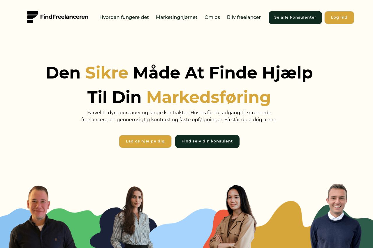
Farvel til dyre bureauer og lange kontrakter. Hos os får du adgang til screenede freelancere, en gennemsigtig kontrakt og faste opfølgninger. Så står du aldrig alene.
Summary:
Open Graph data is the quiet gatekeeper of social shares. On this page the OG data isn’t terrible, but it isn’t optimized to grab clicks in feeds. The title mirrors the hero and brands the service, which is good for recognition, but it’s a bit long for social previews and will likely be truncated. The description communicates the core benefits, which is solid, but it’s somewhat dense for social cards. The attached image looks on-brand and friendly, which suits a B2B freelancer audience, but you’re relying on a single asset that may not render perfectly across platforms. Critical gaps: missing OG tags like og:url and og:type, and missing Twitter Card data. If someone shares this, you’re leaving potential engagement on the table. Short-term win is to fix meta tags and optimize the image for social, long-term win is to own brand consistency across all previews and tooling. Keep the copy tight, ensure accessibility, and verify the image loads reliably across networks.
- Shorten the OG title to about 60 characters so it survives in-feed previews without truncation.
- Trim the OG description to 150–160 characters while preserving the core value props (screened freelancers, transparent contract, ongoing follow-ups).
- Add standard OG/Twitter tags (og:url, og:type, twitter:card, twitter:title, twitter:description) and ensure og:image is 1200x630 (or 16:9) with fast load times and accessible alt text.