bestboilerplates.com
Landing Page Analysis
Find the best SaaS boilerplates and starter kits. Compare features, prices, and choose the perfect foundation for your next project.
Summary:
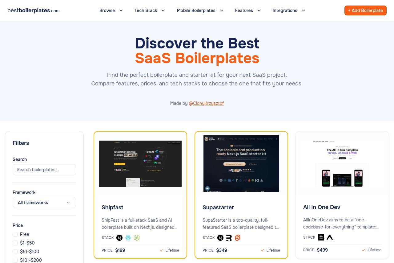
The page nails clean, friendly visuals and a clear focus on SaaS boilerplates, but it trips over conversion fundamentals. The heroPromise is decently stated, but there’s no strong, tangible promise or CTA above the fold to push users into the directory. The filters on the left visually dominate the fold, turning the page into a catalog instead of a guided discovery experience. Card previews are appealing, yet there’s no explicit, consistent CTA on each card to explore or compare, so users drift rather than are guided. Trust cues exist (logos and mentions), but there’s no compelling narrative or proof tailored to a specific buyer persona. Overall it’s aesthetically solid, but the path from landing to action is underdeveloped and the Open Graph data is underutilized for click-through quality. The Open Graph data would benefit from a sharper, benefit-focused hook and a stronger, correctly sized image to maximize social impact.
- Clarify the primary value prop above the fold and add a strong, visible CTA (e.g., “Browse Boilerplates” or “Compare Starters”) with a contrasting color and a subhead that highlights tangible outcomes (ship faster, cut boilerplate time).
- Rebalance the left filter panel so it doesn’t overpower the fold. Consider collapsing it behind a toggle on mobile and a slim, non-intrusive filter bar on desktop to reduce cognitive load.
- Add explicit CTAs on cards (e.g., “View details”, “Compare features”) with consistent styling, hover states, and a clear path to pricing. Include a brief benefit bullet under each card to reinforce why that boilerplate is relevant.