georgemaijoagri.com
Landing Page Analysis
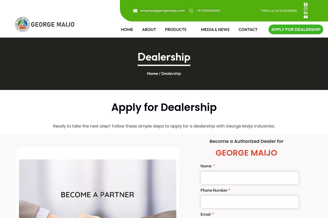
High-margin models, strong service support, and exclusive year-end offers. Start your profitable dealership journey today.
Summary:
This page is shouting “Dealership opportunity” in brand-green, but the message never actually proves why a dealer should care or what they’re getting beyond vague perks. The hero feels visually strong, yet the core value proposition is muddled and buried in sections that copy-paste benefits rather than answering a dealer’s burning questions: what’s the exact offer, what’s the margin, and how easy is onboarding? The form experience is a mess—an intrusive modal and a long intake form that rifled through the content instead of guiding the user. The layout is ambitious, but the execution is inconsistent: some sections look polished, others feel like placeholders. If you’re targeting B2B dealers, you need crisp positioning, tangible benefits, and a frictionless path to inquiry. Right now, the page signals credibility sparingly and pushes the user into a heavy, multi-step interaction before you’ve earned their trust. The branding is solid, but the UX and messaging fail to convert without asking for a big commitment up front. You have the bones to be good, but you’re far from ready to scale dealer signups without a ruthless cleanup of value, trust signals, and flow.
- Clarify the core dealer value proposition above the fold in one crisp line (e.g., "High-margin, fast-onboard dealership program for premium agri-machinery – start earning from day one"). Show a quick visual preview of margins or onboarding steps alongside it.
- Remove or defer the intrusive modal form. Replace with a consistently accessible, non-blocking form embedded in the page or a clearly labeled, single-step lead form after the benefits section to reduce friction and cognitive load.
- Streamline the benefits and pricing messaging. Replace long blocks of copy with scannable bullets, concrete numbers (margins, onboarding time, support levels), and a downloadable one-page summary. Add trust signals (client logos, case study snippet, founder/company legitimacy) prominently near the top.
- Improve CTAs and navigation for a B2B audience. Place a primary, action-oriented CTA after each major section, ensure the CTA text uses verbs and specificity (e.g., "Apply to Become a GM Dealer"), and ensure there’s no more than two distinct CTAs per screen to avoid decision fatigue.
- Enhance accessibility and typography. Increase contrast for form fields, use consistent font sizes, and ensure headings color/weight establish a clear visual hierarchy. Add alt text to images and ensure the footer details are legible on all devices.