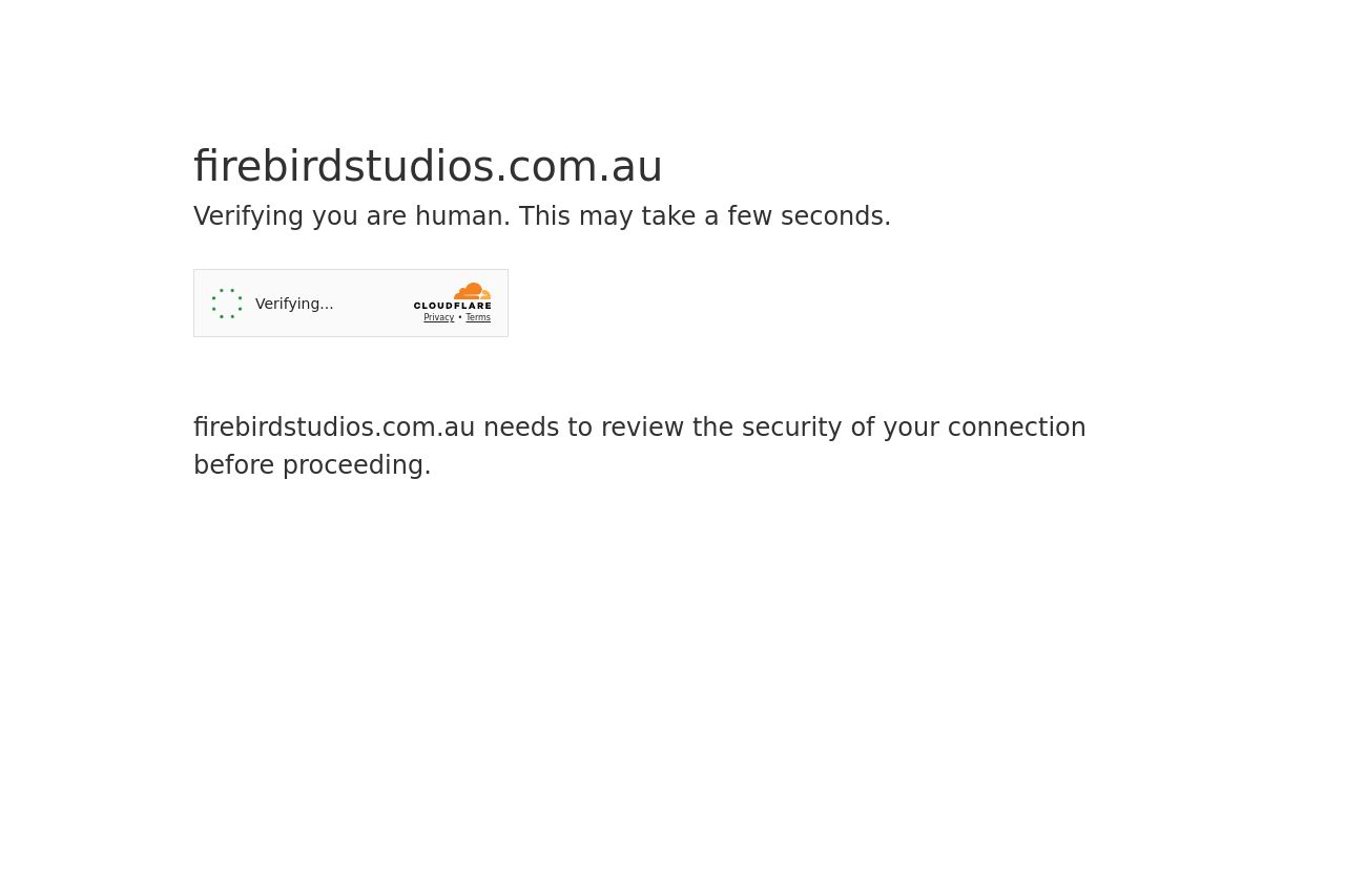
com.au
Landing Page Analysis
Verify you are human by completing the action below.

Summary:
This isn’t a landing page, it’s a Cloudflare gate pretending to be one.
firebirdstudios.com.au shows the big, friendly domain at the top and then a bare instruction: Verify you are human by completing the action below. There is no value proposition, no audience targeting, and no real benefits or features to speak of. The only visible copy after that is a hard blocker: firebirdstudios.com.au needs to review the security of your connection before proceeding. That’s not a pitch, it’s a wall. The page oozes friction, trust issues, and confusion, which is the exact opposite of conversion-friendly marketing. The bottom “Ray ID” line and the Cloudflare branding are noise that make the page feel opaque rather than trustworthy. In short: blocking access with a security gate is a non-starter for a workshop site looking to convert, and it undermines any credibility you might have built elsewhere.
- Replace the gate with actual marketing content or ensure the gating happens after a clear, value-driven hero section (headline, subhead, and a primary CTA).
- If Cloudflare blocking is unavoidable, surface a clear, customer-centric explanation and next steps before the gate appears (e.g., what the user gains by continuing, ETA, and support options).
- Remove or reframe the extraneous Cloudflare/ray-id noise behind the gating so the user trusts the page and understands why they’re being blocked.