gotbackuptour.com
Landing Page Analysis
78
Website:
https://ndanp.gotbackuptour.comGenerated on:
December 8, 2025Score:
78/100Audience:
online earners,individuals/enterprises who need their data securedShare on:
Summary:
72
Messaging
60
Readability
85
Structure
84
Actionability
85
Design
60
Credibility
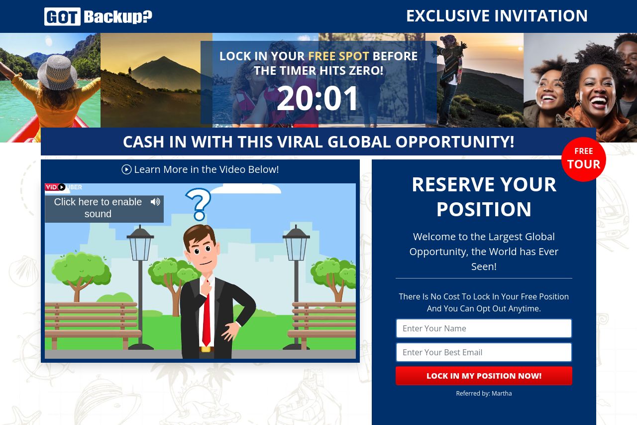
Bold visuals, loud urgency, and a splashed of flashy claims. But the page shoots itself in the foot with a murky value prop and zero credible trust signals. It tries to sell a “viral global opportunity” while the real, obvious benefit (protecting data) is buried in the copy and imagery. The hero countdown, multiple CTAs, and a video mockup scream urgency, yet there’s no transparent mechanism, pricing clarity, or privacy policy to earn trust. Overall: too noisy, too generic for online earners who actually care about data security, and dangerously light on proof.
Main Recommendations:
- Define a crystal-clear, audience-specific value proposition centered on data security and data recovery, not on an earnings pitch. For example: "Protect photos, videos, and sensitive data with enterprise-grade backup—simple, secure, and private."
- Consolidate CTAs into a single primary action and remove or de-emphasize hype like countdowns. Use one clear CTA above the fold (e.g., "Secure My Data Now").
- Add credible trust signals immediately (privacy policy, contact info, physical address, and testimonials from real customers) and replace generic stock imagery with on-brand visuals that align with data security.