amazon.it
Landing Page Analysis
Get ready for Prime Day and learn more about how to make the most of it and take advantage of the global scale of this event to reach more customers on Amazon.
Summary:
The page effectively highlights Amazon's Prime Day benefits for sellers, offering clear calls to action and using a professional tone. However, some sections could benefit from better text simplification and a more engaging use of visuals.
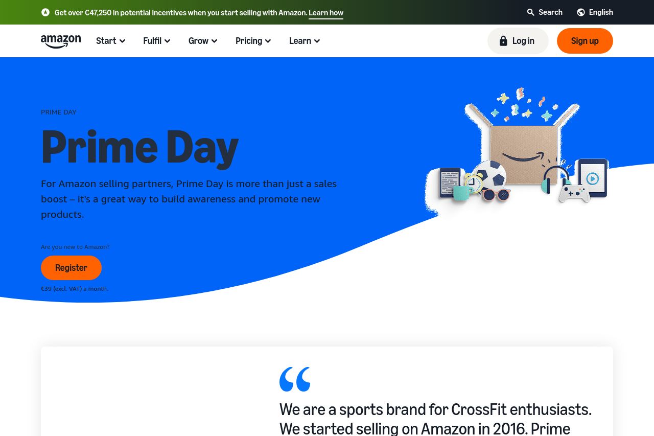
The homepage does a great job of introducing Prime Day as a significant opportunity for sellers, with a bold blue color that draws attention but doesn't overwhelm. The text is concise and uses action-oriented language, especially in CTAs like "Create a deal" and "Get ready for Prime Day". However, the cookie consent banner is a distraction and takes up too much space, which can irritate users.
The imagery, while fitting the Amazon brand, is somewhat generic and lacks a punchy, memorable quality that would make it stand out more. Testimonials are well-integrated, boosting credibility, but the heavy reliance on text and small fonts can strain readability. The hierarchical layout effectively emphasizes important points, though better typography could further enhance clarity.
Overall, it's a competent presentation of Prime Day information, lacking only in a few specific areas to hit a more engaging and visually intriguing note.
- Enhance visual elements with more engaging and unique graphics to capture attention.
- Streamline the use of space to reduce the intrusion of the cookie banner.
- Improve typography to enhance readability and break down longer sections of text.