grweb.site
Landing Page Analysis
33
Generated on:
November 20, 2025Score:
33/100Audience:
teachersShare on:
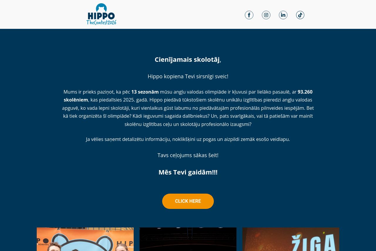
Summary:
30
Messaging
40
Readability
40
Structure
35
Actionability
30
Design
10
Credibility
The landing page aims to address teachers, but it's riddled with missed opportunities. The messaging is overly verbose and fails to highlight the unique benefits in a clear, engaging manner. The hero section text is cramped with information, making it difficult to digest what's important. Visual cues like font sizes and colors lack contrast, making the page feel visually monotonous. The call-to-action button text is generic ("CLICK HERE"), and its placement doesn't stand out, reducing user engagement. The images present on the page do not effectively support text content and fail to illustrate the benefits or impact of the event. The form section feels like an afterthought, with a dull design that doesn't encourage participation.
Main Recommendations:
- Simplify and clarify the main value proposition to highlight unique benefits for teachers.
- Improve the visual hierarchy with distinct font sizes and colors to emphasize key sections.
- Revamp the CTA button text to be more specific and action-oriented, such as "Join the Journey" or "Discover More."