launchdirectories.com
Landing Page Analysis
100+ Product Hunt alternatives & startup directories with traffic stats & guides. Free & paid options. Build backlinks, launch your product.
Summary:
Launch Directories aims to provide a comprehensive resource for submitting startups to directories. The messaging is overall clear, with the main value proposition of submitting to over 100 directories being communicated, but it lacks some precision in detailing specific benefits for various audience segments. The tone is generally appropriate for an audience of startup founders and marketers. Readability scores well thanks to simple text and good visual clarity, although typography could be enhanced with better hierarchy.
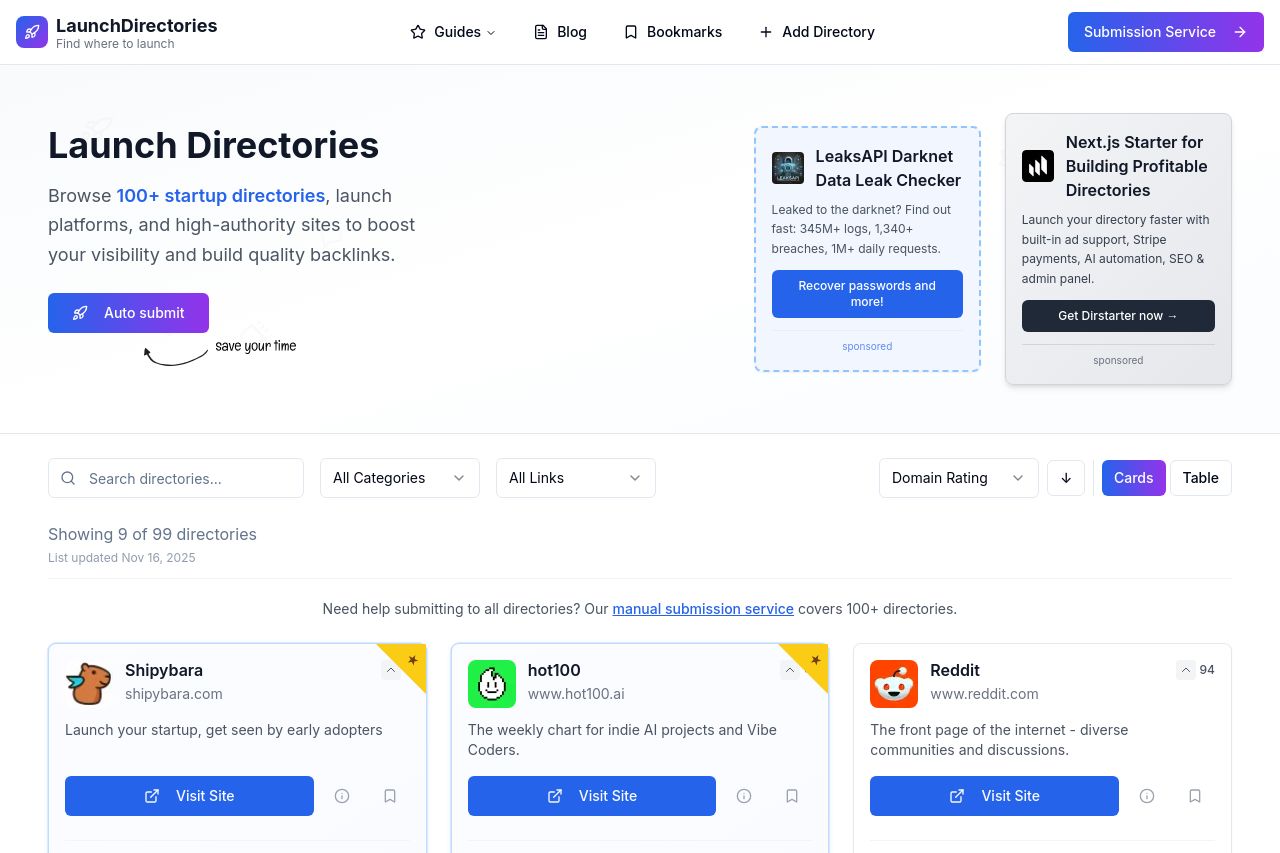
In terms of design, the site is functional but lacks a bit of punch. Visual hierarchy is mostly okay, but some areas like the CTAs could be more prominent. Color usage is a bit bland and could be more engaging. Structure is a little cluttered, especially with information density around the directory listings—navigation is fine, but headings could be more cohesive.
The actionability of the CTAs is reasonable but uninspiring; they need more creativity in their wording to drive action. Credibility is decent, with testimonials and founder information contributing positively, although more transparent details like a physical address and email could be helpful.
- Refine CTA text to be more action-oriented, e.g., "Boost My Launch Now".
- Improve the visual hierarchy by using bolder fonts for headings and CTAs.
- Enhance design with a more vibrant color scheme to attract attention.