nameknow.com
Landing Page Analysis
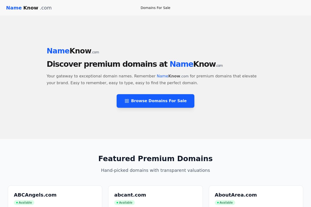
Discover premium domains at NameKnow.com
Summary:
The landing page is clean and visually simple, catering effectively to the target audience of startup founders and brand consultants. The value proposition is clear, focusing on premium domain sales, which is highlighted right at the top. The call-to-action (CTA) button, "Browse Domains For Sale," is prominently displayed and easy to spot, which is excellent for conversion.
The featured domains section is well-organized with transparent valuations, providing clarity and reinforcing trust. However, the lack of social proof, such as testimonials or client logos, weakens credibility. The footer feels barren, losing an opportunity to reinforce trust or provide easy navigation.
The overall readability is decent, with clear typography and legible font sizes, though some text does feel repetitive, such as continuous mentions of the domain name brand. The color scheme is functional but uninspired, dealing with a simplistic palette that lacks boldness but keeps things accessible.
Structure-wise, the page is straightforward and doesn't overwhelm users with information, maintaining a logical flow from introduction through domain listings. However, the section where domain pricing is presented could use more engaging elements to maintain interest.
- Add testimonials or client logos to build credibility.
- Enhance the footer with additional navigation or contact information.
- Include more engaging elements or visuals in the featured domains section.