loca.lt
Landing Page Analysis
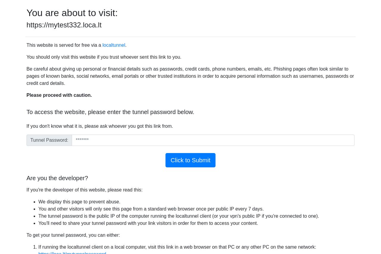
This website is served for free via a localtunnel.
Summary:
This page is more of a placeholder than a proper landing page. Your main message feels technical and lacks appeal, especially for visitors who might not understand what a tunnel password is. You're throwing up immediately cautionary walls: "please proceed with caution," etc. – not exactly inviting. The whole page is dominated by a bland aesthetic, fulfilling the "confusing wall of text" trope. The call-to-action lacks punch and urgency, merely saying "Click to Submit." I see zero meaningful attempts to engage the visitor, and you lost points with the typeface and color choices. The directions for developers and bypass instructions are overly complicated and better suited for a technical manual – way too much detail for an average user.
- Revamp the visual design to be more engaging and less text-heavy.
- Clarify and simplify the purpose of the page for non-technical users.
- Enhance the call-to-action to be more appealing and urgent.