subchecks.com
Landing Page Analysis
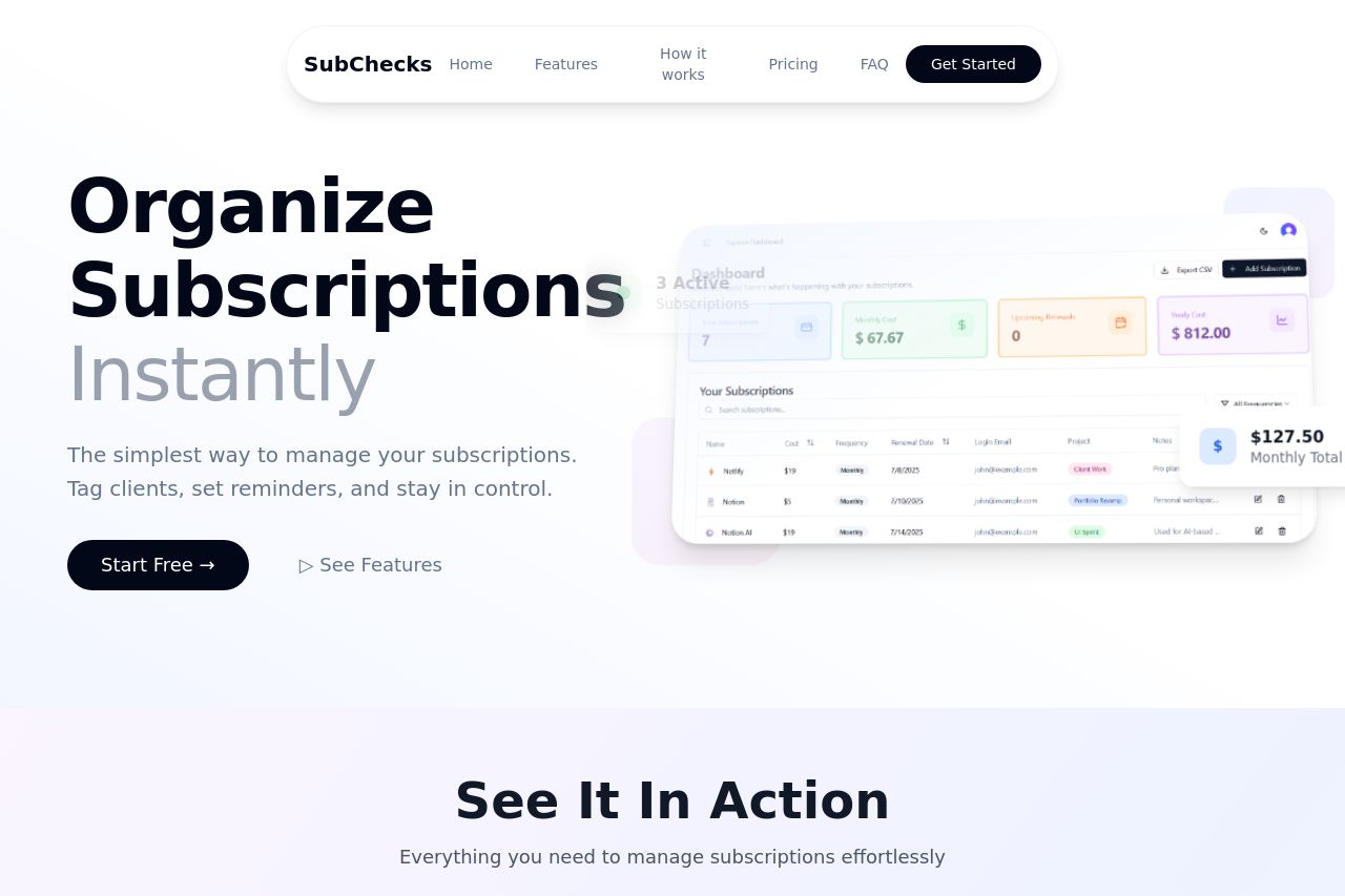
Track your freelance SaaS subscriptions by client or project. Get renewal reminders. Avoid surprise charges.
Summary:
SubChecks provides a clear purpose and audience focus with its straightforward subscription management tool targeting freelancers. The landing page excels in clarity and simplicity, making use of a clean layout and professional design. However, the call-to-actions, while visible, could be more persuasive and strategically placed to enhance conversion potential. The messaging is concise but lacks depth in defining unique benefits. Consistency in design elements is commendable, yet there's a slight disconnect with some imagery not enhancing comprehension. Pricing details are effectively highlighted, yet the CTA could be more assertive. Social proof is present in testimonials but could be bolstered by additional trust elements such as recognizable partner logos.
- Add more recognizable client logos or partnerships for trust enhancement.
- Revise CTA phrases to be more action-oriented and specific, e.g., "Explore Features Now!".
- Enhance the imagery to better illustrate features and use cases.