co.in
Landing Page Analysis
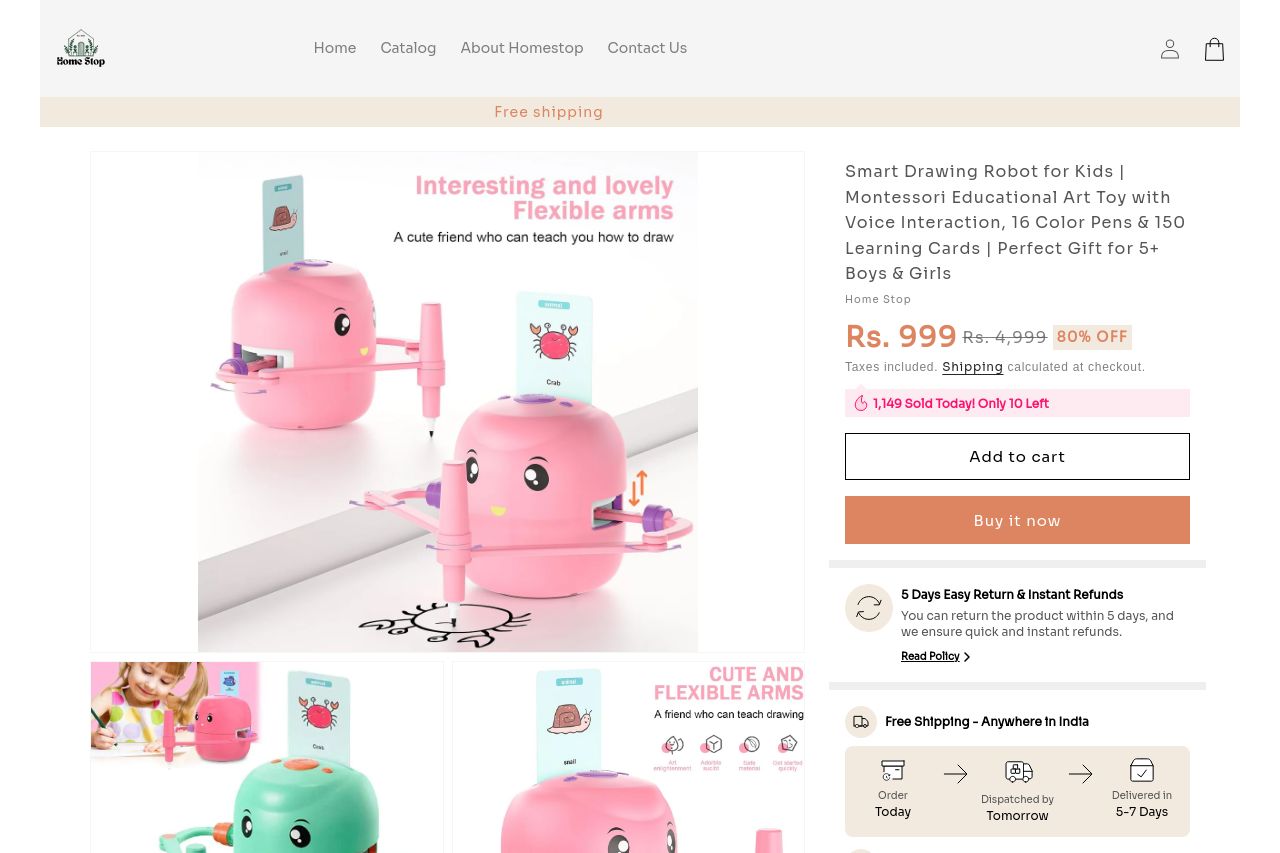
【Creative Enlightenment Drawing Robot Companion】The drawing robot fosters creative discovery and foundational skill development in kids. Rooted in Montessori methodologies, it promotes interactive dis
Summary:
This landing page makes an effort to present a playful product for kids, but falls short in several key areas.
The Messaging is somewhat clear, but overly repetitive. Phrases like "interesting and lovely flexible arms" lack a punch, distracting rather than drawing in interest. While the visuals support the product's appeal, the text-filled images become overwhelming and redundant.
The Readability suffers due to convoluted text and poor contrast. While attempting to keep things lively, the font size and colors don't do justice to a child-friendly brand aesthetic. Key information is scattered, lowering engagement.
Design aspects lack in visual hierarchy, mixing pastel colors without a guiding focus. The large pink "Buy it now" button, though prominent, feels intrusive and mismatched in spacing.
Structural components need a better flow. There’s too much "cute" language, distracting from real value propositions related to teaching kids through play.
In terms of Actionability, CTAs are buried in a barrage of text. Rather than guiding, they feel like an interruption, especially the "Buy it now" button repeated several times in short succession.
Credibility is a major downfall, missing social proof like testimonials. The consistency in messaging lacks trust-building elements, ultimately casting a shadow over the product’s educational claims.
- Simplify text and improve contrast for readability.
- Add customer reviews or testimonials for credibility.
- Consolidate CTA placement and simplify its presence.