skywork.website
Landing Page Analysis
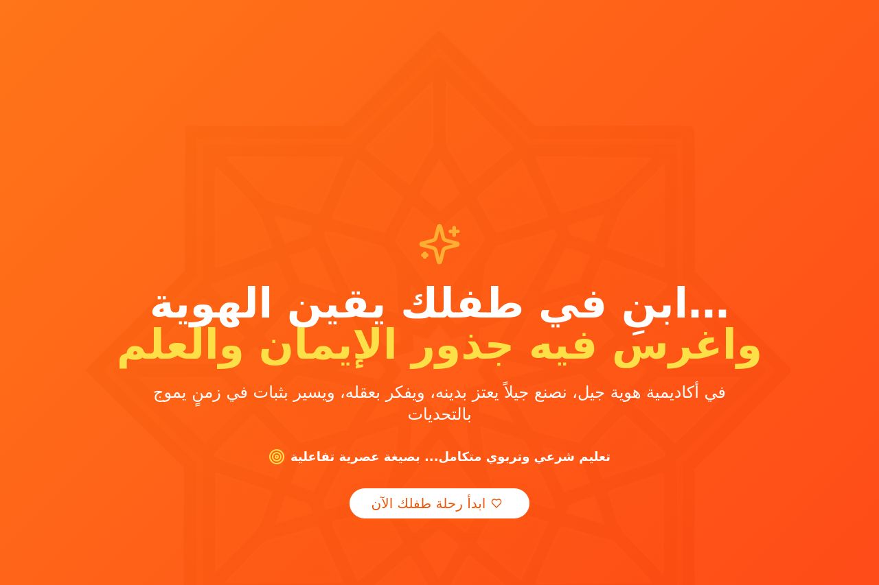
أكاديمية هوية الجيل - منارة تربوية تُغذّي العقول وتُهذّب النفوس، وتبني جيلاً يعتز بهويته الإسلامية الراسخة. تعليم شرعي وتربوي متكامل بصيغة عصرية تفاعلية للأطفال من 5-17 سنة.
Summary:
The landing page effectively presents a cohesive and clear educational offering. The bold orange theme creates a vibrant and hopeful aesthetic. However, the value proposition is generic, focusing broadly on identity and education without delimiting specific benefits. Visual hierarchy is well-considered, with typography directing attention to essential parts like headers and CTAs.
The language is engaging but a bit verbose, with areas of text needing simplification. Typography and layout remain consistently clean, although some text blocks are quite dense, affecting readability. The layout is orderly, well-structured, and headings guide the reader intuitively through the page.
The calls to action are present but lack urgency and distinctiveness, blending in too much with the rest of the text. Social proof, through testimonials, boosts credibility. There's a notable absence of specific contact options like live chat, which reduces transparency.
- Refine the value proposition to highlight clear, specific benefits of the academy.
- Enhance call-to-action buttons with a more contrasting design to make them stand out.
- Simplify dense text areas for improved readability and engagement.