vercel.app
Landing Page Analysis
Subscribe to receive the source code directly in your inbox!
Summary:
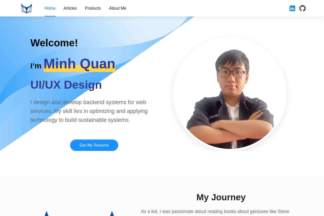
The page has a strong personal connection, emphasizing the individual's journey and principles. The hero section introduces Minh Quan with an engaging personal photo and a clear call-to-action. The narrative tone is consistent, making it relatable, though the text can be simplified. Displaying principles and core values effectively makes a personal brand statement. However, text contrast and hierarchy could be improved for some sections. The product section is showcased with an enticing glimpse into products and articles, though descriptions could be less wordy. Navigation is clear, but the call-to-action buttons could be more engaging. Testimonials provide credibility, and transparency is evident through contact details. The design is cohesive but lacks a distinctive visual flair, and the color palette is slightly monotonous.
- Enhance color contrast for better readability.
- Improve CTA buttons to be more action-oriented and specific.
- Simplify text to be more concise and easier to read.