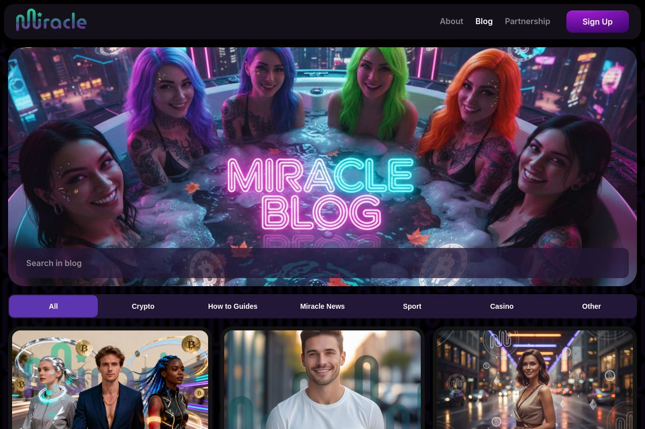
miracle.casino
Landing Page Analysis
Insights and tips on crypto gaming, bonuses, and casino trends from Miracle Casino.
Summary:
While the blog on Miracle Casino provides some useful insights into crypto gaming and casino trends, the overall layout and organization leave much to be desired.
The site lacks a standout value proposition, making it difficult for visitors to understand what distinguishes this casino's blog from a host of others.
The tone does not align with any specific audience, creating a sense of vagueness rather than authority or engagement. The design manages to look professional while actually being generic. Too often, the sections blend into each other without an effective hierarchy to guide the reader's eye. This lack of focus is exacerbated by CTAs that are neither strategic nor particularly visible. Credibility could be boosted by underscoring trust elements and showing a bit more transparency.
Readability is the only category where the blog makes an acceptable mark, with half-decent typography keeping text from becoming overwhelming. Ironically, this isn't enough to save the content from lacking the punch necessary to engage readers. The credibility could use a boost with strong testimonials, logos, or founder details, which are altogether missing here.
- Place trust elements such as badges and recognizable client logos to boost credibility.
- Clarify the unique value proposition right away. State why this blog is a must-read in the crypto gaming space.
- Revamp CTAs by making them strategic and well-placed to lead users through a journey.
- Align the tone with a specific target audience to create a cohesive brand voice.
- Improve the information hierarchy; present only the most critical information initially.