italprogress.it
Landing Page Analysis
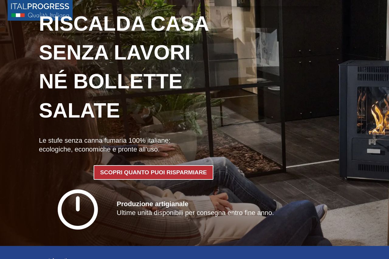
Riscalda casa senza lavori né bollette salate. Le stufe senza canna fumaria 100% italiane: ecologiche, economiche e pronte all’uso.
Summary:
The landing page clearly presents its main value proposition: eco-friendly Italian stoves that don't require extensive installations or increase utility costs. The headline is bold and attention-grabbing with "RISCALDA CASA SENZA LAVORI NÉ BOLLETTE SALATE," but the redundancy in messaging makes it lose impact over time. Images support the content well, but the overall layout is cluttered, particularly with repeated call-to-action buttons like "INIZIA A RISPARMIARE ORA," making navigation confusing. There is a robust use of testimonials, yet the typography suffers from cramped and unappealing font choices, reducing readability. Social proof is displayed prominently, enhancing credibility, though the presence of excessive cookie disclaimers disrupts user experience. CTAs are present but don’t stand out enough, blending too much with surrounding texts.
- Simplify text and reduce redundancy in messaging to maintain user interest.
- Improve CTA visibility and offer a clearer, singular path to conversion without repeating the same button excessively.
- Enhance typography for better readability by choosing more appealing and less cluttered font sizes and styles.