poderpleno.com
Landing Page Analysis
Nome de usuário ou endereço de e-mail
56
Generated on:
November 15, 2025Score:
56/100Share on:
Summary:
30
Messaging
85
Readability
75
Structure
70
Actionability
50
Design
10
Credibility
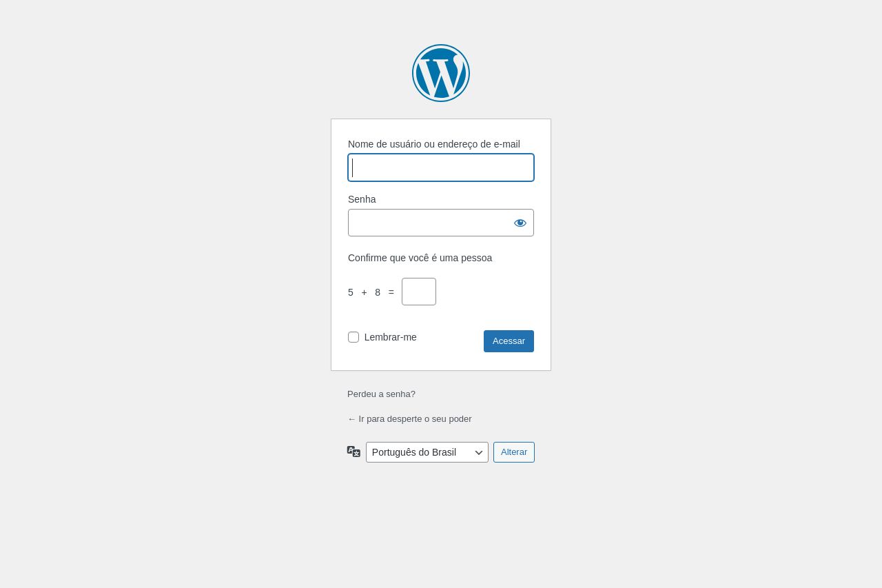
The login page is basic but functional. It maintains simplicity, which is good for usability, but lacks any engaging elements to make it visually or experientially appealing. The use of a captcha is a decent security measure, but overall, the design is quite bland and uninspired. The call to action "Acessar" could stand out a bit more, and there are no trust signals or branding efforts, making the page feel generic.
Main Recommendations:
- Add branding elements such as a company logo or color scheme to enhance recognition and trust.
- Make the "Acessar" button more prominent with bolder colors or larger size.
- Include a brief welcoming message or introduction to make it feel more engaging.