saldoanalys.se
Landing Page Analysis
Bokför Din framtid!
Summary:
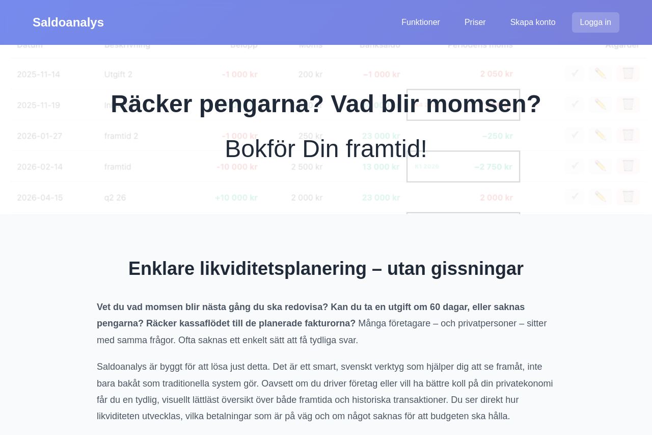
The landing page for Saldoanalys does a decent job of addressing SME concerns around liquidity planning and VAT calculations; however, the execution leaves much to be desired. The headings such as "Räcker pengarna? Vad blir momsen? Bokför Din framtid!" are bold and engaging, capturing immediate attention. Still, they fail to fully convey specific value propositions or define the target audience.
Visual hierarchy is mildly present, but the layout feels a tad monotonous due to the minimal variation in color and font weights. Typography is basic and readable, but layout issues such as text width and lack of distinct formatting affect readability negatively.
The design consistency is commendable, featuring a clean and professional aesthetic; however, there are missed opportunities for enhancing visual appeal and interaction through better use of icons or images. The pricing section stands out visually, providing clear differentiation between options, yet the CTAs could be more enticing and strategically placed.
Overall, creditability indicators like social proof or testimonials are entirely absent, easily eroding trust. Professionalism is evident, although transparency is lacking due to missing contact information and policy details.
- Enhance the value proposition in the hero section to clearly explain the benefits.
- Incorporate social proof elements like testimonials or client logos.
- Improve readability by breaking long paragraphs into bullet points.