tupausa.com
Landing Page Analysis
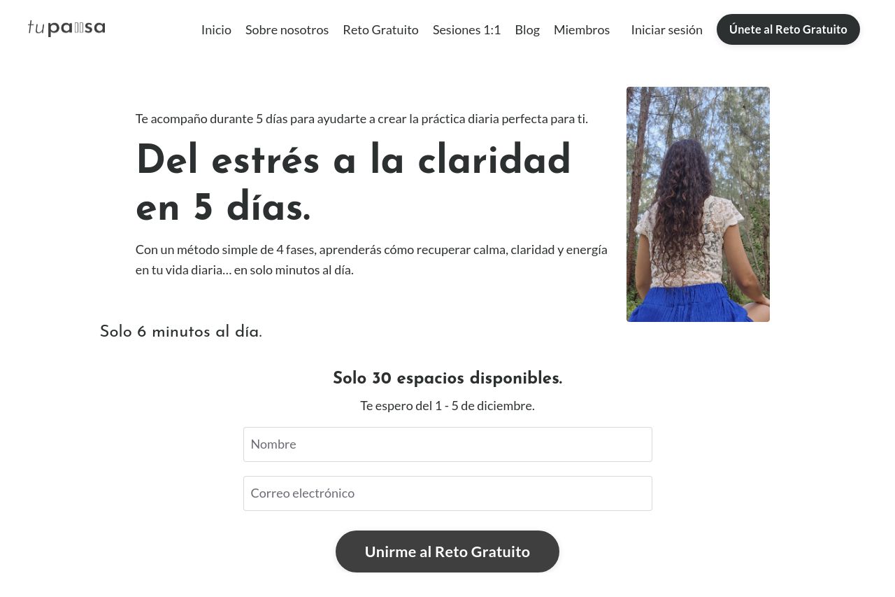
Te acompaño durante 5 días para ayudarte a crear la práctica diaria perfecta para ti.
Summary:
The landing page offers a clear value proposition: a 5-day stress reduction challenge. The main headline, "Del estrés a la claridad en 5 días," is effective in capturing attention, emphasizing the promise of clarity. The promise of simplicity, "Solo 6 minutos al día," adds a unique selling point. However, the page feels a bit monotonous and lacks engagement through visuals or dynamic elements. Typography is consistent, but the design is a bit dull and doesn’t make crucial elements like the CTA stand out. Testimonials provide credibility, but the lack of strong, engaging visuals or standout CTAs limits overall impact. Overall, it provides the necessary information but lacks flair to captivate and drive conversions.
- Add dynamic visuals or graphics to make the page more engaging.
- Enhance the CTA buttons to stand out more visually.
- Include more varied testimonials or reviews for enhanced credibility.