hotkinginstruments.com
Landing Page Analysis
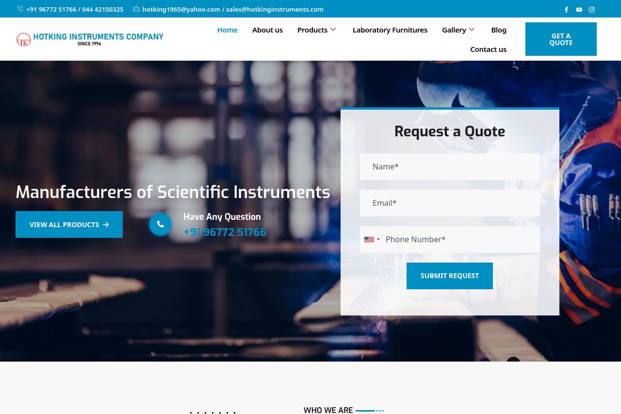
Manufacturers of Scientific Instruments Continually grow enabled applications before reliable platforms. Completely productize front-end action items and bleeding-edge methods. Uniquely maximize one-t
Summary:
The landing page offers a clear indication of the company's specialization as manufacturers of scientific instruments. It effectively highlights credibility with ISO certifications and a strong list of clients. There is a professional appearance overall, with call-to-action (CTA) elements like 'Request a Quote' present in visible locations.
However, there are several missed opportunities and setbacks:
Messaging: There's a lack of a strong value proposition. The text is generic and lacks direct appeal to a specific audience segment.
Readability: The copy is overwhelming with dense paragraphs and suffers from excessive jargon. The sections blend together, and the visual hierarchy is poor, making it hard to digest the information.
Design: The design might appear a bit cluttered. The CTAs, while present, do not pop out due to a lack of color accentuation.
Structure: Important information is present but scattered. The overall layout is not intuitive and hard to follow; headings could be more descriptive to guide users through the page.
Credibility: The site does well in showing client logos but could benefit from stronger, more visible social proof elements like detailed testimonials.
- Simplify the text and avoid industry jargon to improve readability and engagement.
- Improve the visual hierarchy by utilizing different text sizes and colors to emphasize key information and CTAs.
- Enhance the social proof with more detailed testimonials and visible badges/certificates.