advantagepaid.media
Landing Page Analysis
Struggling with attribution? We help scaling brands gain clarity and drive growth through paid media, media mix modelling, and multi-touch attribution.
Summary:
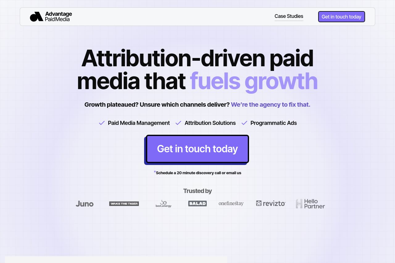
The landing page for Advantage Paid Media is well-structured and visually appealing, but some areas could use refinement. The hero section sets a bold tone with strong value propositions like "Attribution-driven paid media that fuels growth," yet more clarity on the specific solutions offered is needed. The CTAs are vibrant but somewhat repetitive, lacking the enticing language that could drive immediate action. Additionally, while testimonials and awards bolster credibility, the layout could use more dynamic presentation to capture attention fully.
The language is tailored for marketers, avoiding excessive jargon. However, the interplay of text and graphics becomes monotonous over extensive scrolling. Consistent color usage provides brand cohesion but lacks enough visual hierarchy to guide the reader effectively. The page's structure is logical, with a clear flow from problem to solution, but could focus more on detailed client success stories or concrete examples of media strategy in action.
Overall, the website needs tweaks in visual dynamism, specificity in value proposition, and engaging CTA wording to fully captivate its audience.
- Enhance the visual hierarchy, use bold text for key benefits.
- Refine CTA wording to increase urgency and specificity.
- Add interactive elements or case study previews to increase engagement.