italprogress.it
Landing Page Analysis
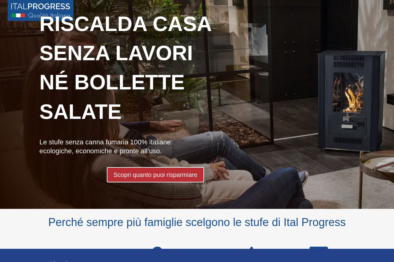
Riscalda casa senza lavori né bollette salate. Le stufe senza canna fumaria 100% italiane: ecologiche, economiche e pronte all’uso.
Summary:
The landing page for Ital Progress tries to present an appealing alternative to traditional heating solutions with a strong eco-friendly angle. However, the execution leaves much to be desired. Messaging lacks engagement, failing to effectively communicate the uniqueness of the stufe. Repetitive CTA buttons like "Scopri quanto puoi risparmiare" are dull and uninspiring, and there's a redundancy that could frustrate users. The design feels inconsistent, with scattered text and visuals that make the page appear disconnected. Readability is hindered by lengthy blocks of text that overwhelm rather than inform. There's little flow in how information is delivered, with key insights buried amidst filler content. The testimonials provide some social proof but feel like an afterthought tucked away towards the end. Overall, the page suffers from trying to say too much without saying anything particularly convincing.
- Simplify and focus the messaging to highlight key benefits only.
- Improve the visual design for consistency, especially with typography and color.
- Enhance the readability with clear headings, better spacing, and reduced text blocks.
- Refine CTAs to be more engaging and action-oriented.