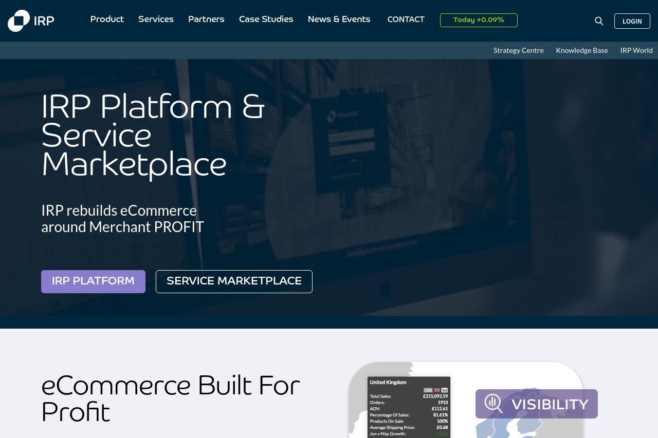
irpcommerce.com
Landing Page Analysis
IRP eCommerce Platform and Service Marketplace are built to deliver Merchant Profit

Summary:
Overall, the IRP landing page presents key elements but fails to make a strong impact where it counts the most. The messaging tries to highlight the platform's focus on "Merchant Profit," but it doesn't adequately explain how the product achieves this key benefit beyond vague promises. There’s a lack of engaging visuals or graphics that underscore the text, making the page bland in more visual areas. The readability takes a hit with some verbose sentences and an uninspired layout, leaving users scrolling past dense sections. The design is cohesive but overly safe—lacking innovation or a striking visual element to captivate a B2B audience that’s used to seeing more sophisticated layouts. CTAs are present but are placed inconsistently, hindering potential conversions. Social proofs are visible, yet they don’t clearly differentiate the uniqueness of IRP compared to its competitors. Ultimately, while the foundational elements are there, the execution leaves much to be desired for inspiring a transition from familiar platforms like Shopify.
- Clarify how the platform uniquely enhances 'Merchant Profit' with concrete examples or case studies.
- Improve the visual hierarchy with standout sections to highlight key takeaways quickly.
- Incorporate interactive elements or multimedia to showcase the platform in action.