nominoe.eu
Landing Page Analysis
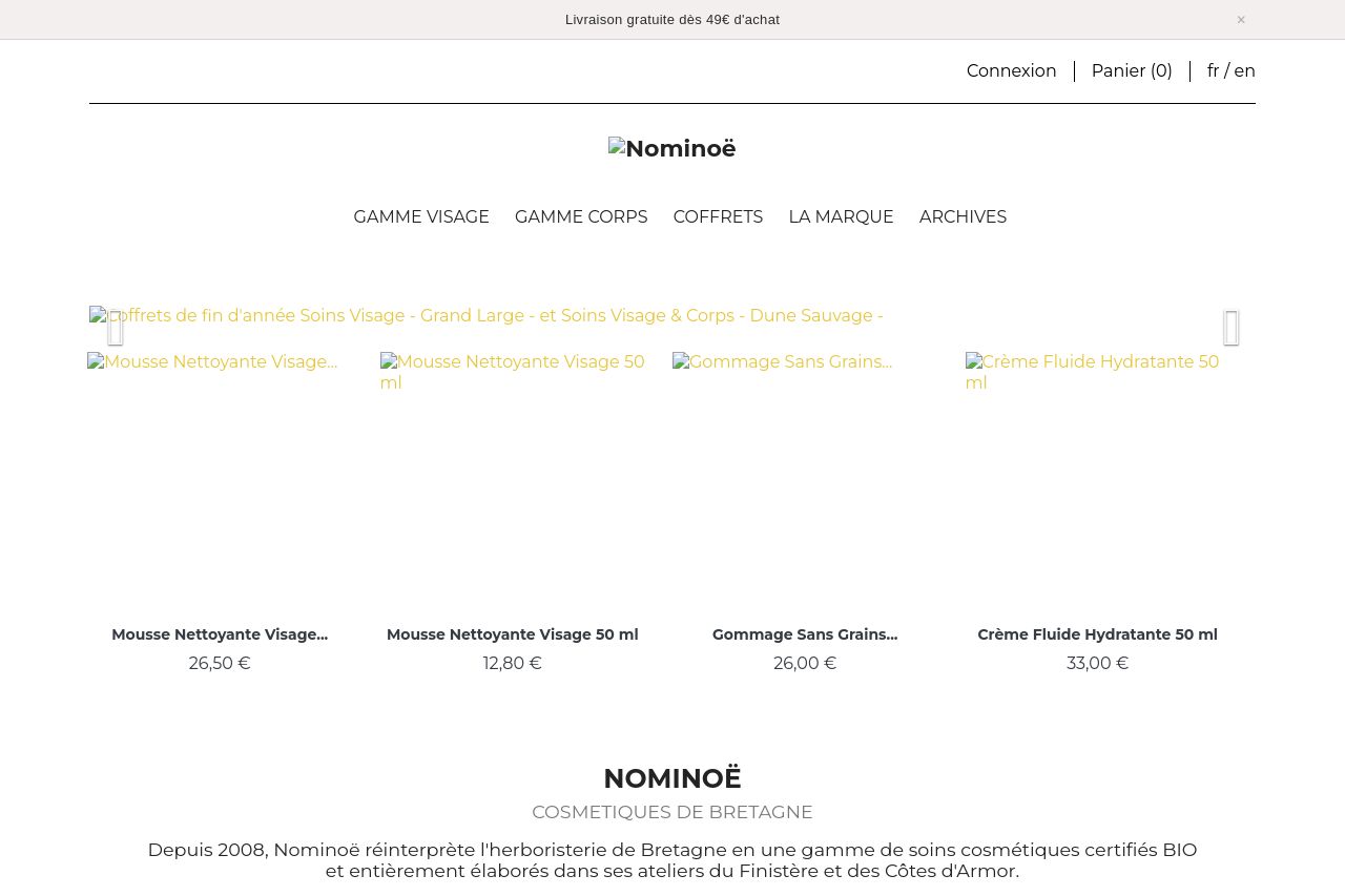
Nominoë - Cosmétiques de Bretagne, soin visage et corps, naturel et bio. Inspirée par les plantes locales bretonnes, une évasion sensorielle depuis 2008.
55
Share on:
Summary:
50
Messaging
40
Readability
50
Structure
40
Actionability
55
Design
80
Credibility
The landing page does a good job at presenting its organic and local product angle, but it becomes quickly cluttered with text-heavy descriptions. The pop-up for a discount is distracting, appearing over key content areas. The color scheme manages to be soothing but may lack contrast, making the call to action less prominent. Information architecture is somewhat disorganized with insufficient visual hierarchy, leading to potential overwhelm for the user. The overall professionalism is decent, but some design improvements are needed for better readability and focus.
Main Recommendations:
- Reorganize the content to highlight main points and benefits efficiently.
- Enhance CTA prominence with better contrast and strategic placement.
- Minimize text-heavy sections for improved readability.