formatic.xyz
Landing Page Analysis
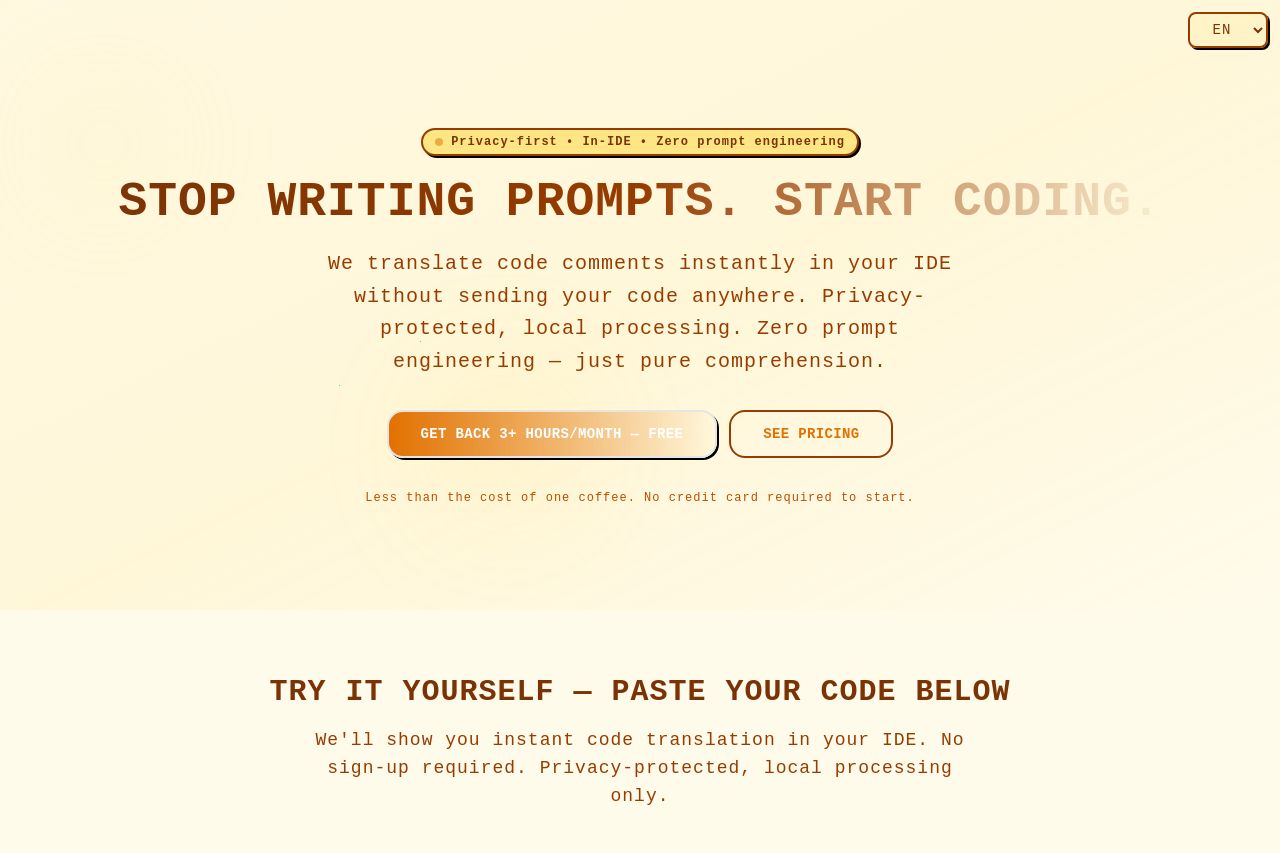
Translate code comments instantly in your IDE without sending your code anywhere. Privacy-protected client-side processing for developers - no data retention, full transparency.

Summary:
The landing page aims for a minimalist approach with its light color palette and straightforward typography. However, it struggles with visual contrast, making elements blend rather than stand out, which is crucial for call-to-action (CTA) effectiveness. Messaging-wise, it successfully positions itself as a privacy-first solution for developers, but lacks direct audience engagement through testimonials or detailed examples of success. The page outline is logical, albeit lacking in dynamic engagement through more persuasive techniques like social proof. The CTA placement varies in effectiveness, and consistency in design elements could enhance the credibility and professionalism of the site overall.
- Increase color contrast for CTAs to make them stand out more.
- Add testimonials or examples to boost credibility and engagement.
- Improve typography by using bolder fonts for headings to enhance visual hierarchy.