onetreedb.com
Landing Page Analysis
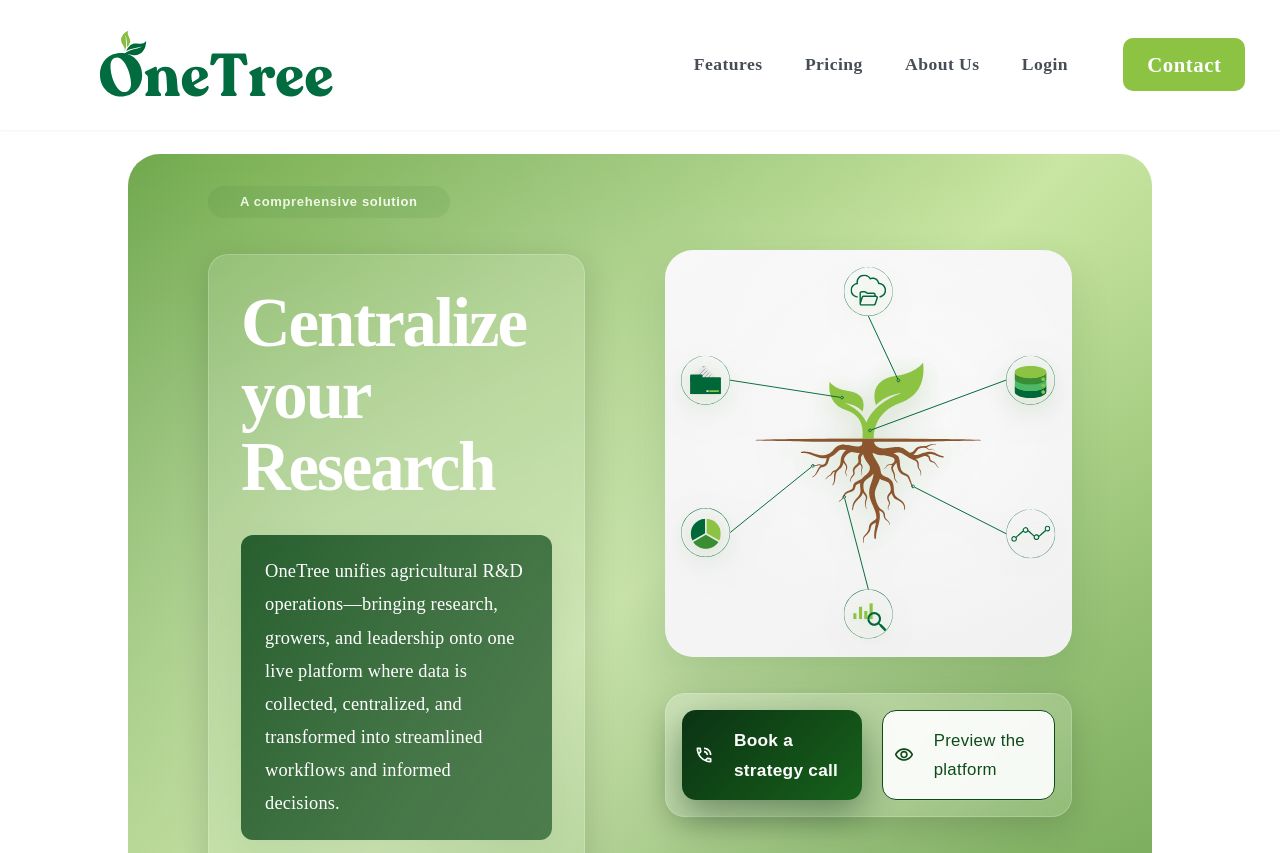
Centralize agricultural research workflows with OneTree. Coordinate trial documentation, analyze data, and share performance insights with growers in real time.
Summary:
The landing page for OneTree provides a decent framework but falls short in several aspects that could impact user engagement negatively. The simple green color scheme is matched well with the target audience in agriculture, but the lack of distinctive CTAs and slightly cluttered layout can detract from the message. The value proposition is clear but perhaps not explicitly targeted toward the specific needs of advanced agricultural R&D professionals. While the text is technically correct, it could benefit from simplification to improve readability. Additionally, the open graph data is fairly aligned but could be more captivating with a stronger, visually dynamic image. Overall, the page does reasonably well but needs work on clear call-to-action placement, improved visual hierarchy, and text clarity to boost effectiveness and engagement.
- Improve the visual hierarchy by emphasizing headings with distinct font sizes and colors.
- Enhance CTAs to ensure they are always unique and action-oriented.
- Consider simplifying the language or breaking up complex sentences.
- Use more whitespace to prevent the page from feeling cluttered.